Official US Nursing home data shows that the COVID vaccines did NOTHING to reduce COVID mortality. ZERO.
The CFR didn't decline after the COVID vaccines were deployed. This means that the vaccines didn't work! The CDC lied, people died.


Executive summary
The CDC lied. People died.
The COVID vaccine had no benefits
It actually increased your risk of getting COVID. We know that from the Cleveland Clinic study.
It did nothing to reduce your risk of hospitalization. We know that from the data revealed in a study published in JAMA by a top epidemiologist at the VA.
The vaccine did absolutely nothing to reduce your risk of dying from COVID. I’m going to show you that below. It’s crystal clear. Rarely in science do you see anything that is this perfect.
In short, the COVID shots were all downside with no benefits. The vaccines and the vaccine mandates cost a lot of people their careers or their lives.
It was a massive con job by the FDA and CDC to make us believe that the vaccines worked when their own numbers show that it didn’t do a damn thing. In fact, I’d bet that they probably didn’t even look at their own numbers from CMS.
No upside, all downside.
My new analysis of the US nursing home data is undeniable
The US Nursing home COVID mortality data is gold standard per-facility data on the most vulnerable population for COVID. There is nothing in the world better than this dataset.
I’ve written about the US Nursing home data many times before (most recently in this article), but now I have a new way to present the data that shows the full story instantly:
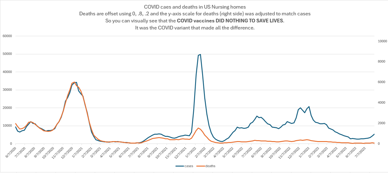
What does it show? It shows the vaccines did NOTHING to reduce mortality. Zero. Zilch. Nada. It’s not even a close call. It’s OBVIOUS from just looking at one graph.
You can verify all this for yourself. I’ve created a dedicated github with the files and the code and the analysis spreadsheet with the graph below.
Here are the details…
The graph aggregates data from 15,058 nursing homes that is reported on a weekly basis. The blue lines (left axis) are cases. The orange lines (right) axes are SHIFTED deaths. The deaths were left shifted by applying a weighting factor of 0,.8,.2 to the death by week. This causes the death curve to align with the cases instead of being delayed. See the spreadsheet for details.
Secondly, I adjusted the scale of the right axis so that deaths would be scaled to match cases.
These two adjustments make it very easy to visualize the case fatality rate (CFR).
When the curves diverge is when you have a change in the CFR.
If the vaccines worked, we should have seen the curves start to diverge more and more from December 2020 through the end of March 2021 (see this article for the rollout curve), and then continue to diverge (at a slower pace) as more and more people were vaccinated.
But this didn’t happen.
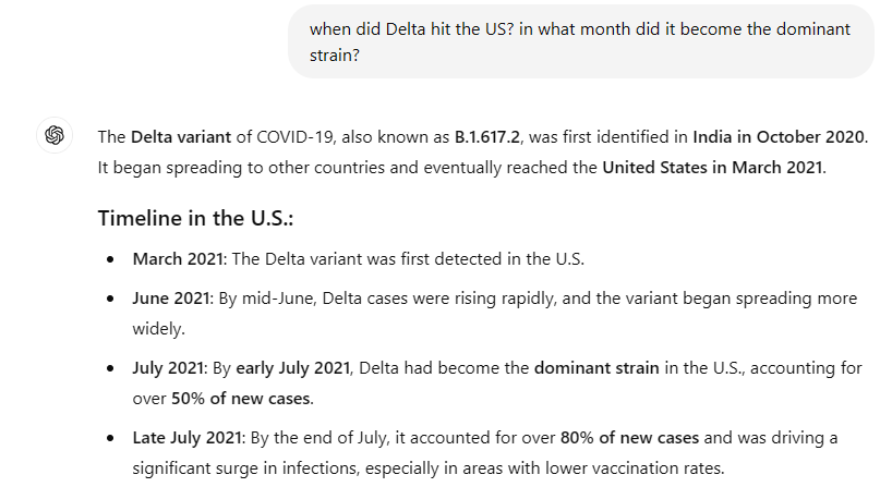
You can see the curves are virtually right on top of each other (which is stunning) until the week ending 7/11/2021 is when we see the very start of a divergence but the divergence (gap between the curves) remains FLAT until Omicron hits. So this was not the vaccine “kicking in.” If that were the case, we’d see a rise over 3 months to maximum divergence and it would continue to diverge after that corresponding to the rollout of the COVID vaccine to nursing homes in the first few months of 2021.
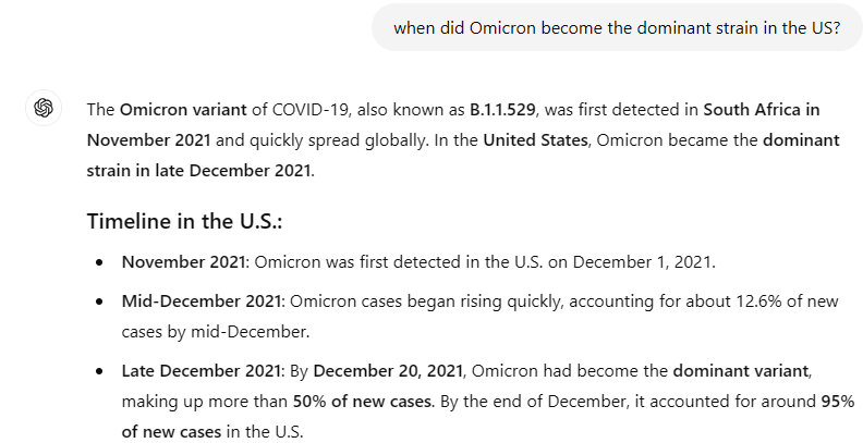
The CFR drops precipitously a second time starting the week ending 12/26/21.
What caused the CFR to drop? It wasn’t the vaccine. It was the dominant COVID variant.
Why did the CFR drop? It was the variant. Check this out and note that when a strain becomes dominant, it matches up to the date when the CFR drops!
To get the big picture, combine this with earlier data
See The COVID vaccine: all risk, no benefit which shows:
Made it more likely to get a COVID infection
Didn’t reduce your risk of hospitalization
Didn’t reduce your risk of dying from COVID
Made you more likely to die of all causes (brand comparison in Czech Republic).
Summary
The COVID vaccines had no benefits: they didn’t reduce your risk of getting COVID, they didn’t reduce your risk of hospitalization, and they didn’t reduce your risk of dying if you did get infected.
The US government’s own data says this. There isn’t any gold-standard database better than this data. It’s devastating. This is why they will never talk about it.
And this is why it’s important that the data is made public so you will know that they demanded you take a vaccine with no benefit.
Over 600,000 Americans lost their lives. For what? For nothing.
And Kamala Harris, if elected, will ensure that there is no accountability for any of this.
If you like my work, please consider becoming a paid subscriber so I can continue to expose the truth. Thanks!
No comments:
Post a Comment