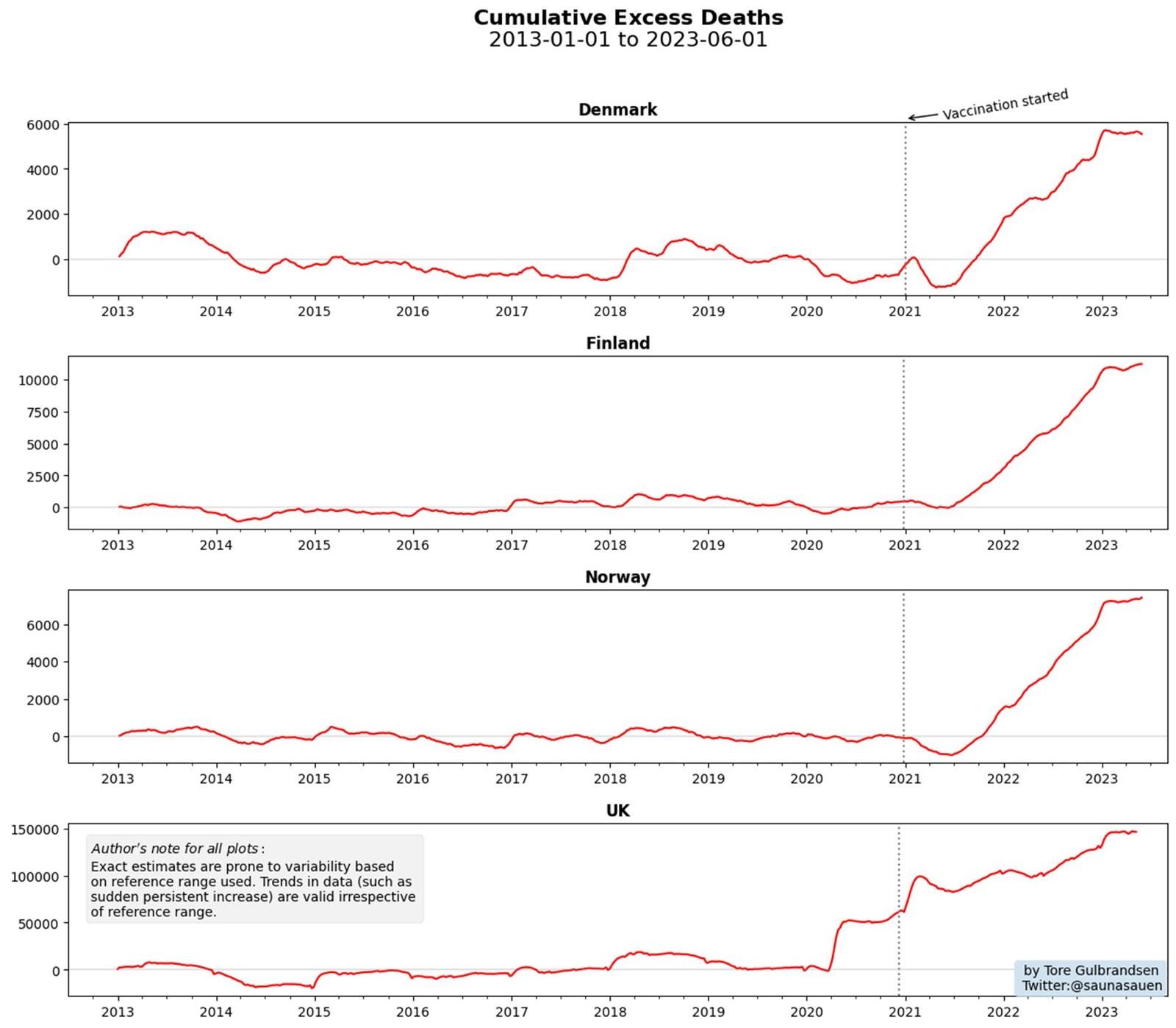
Denmark, Finland, and Norway graphs show all-cause mortality kept rising after the shots rolled outI got a tip from one of my colleagues that Denmark, Finland, and Norway had very similar vaccine policies. Mortality kept going up after the shotsExecutive summaryDenmark, Finland, and Norway keep impeccable statistics. I heard from a scientist in Denmark that the death stats were flat until the shots rolled out. She also said that Denmark stopped reporting daily deaths and has switched to reporting deaths quarterly. Does having less information lead to better health outcomes? Or are they hiding something? Here are the numbers. You decide. I think the numbers are pretty incriminating. The chartIf what they are doing is working, cumulative excess deaths should turn around and fall back to zero. But this just doesn’t happen. Deaths monotonically increase. This means that what they did either had no effect or made things worse. How they can possibly claim success with numbers like these is a mystery to me. The deaths started getting worse after the COVID shots rolled out. If it wasn’t the COVID shots, what is fueling the monotonic rise in excess deaths? Here is the original graph I got from my friend. Notice how similar the shapes are and that it flatlines at the same time. Nature simply doesn’t work like that in different countries. These are essentially man-made effects. Essentially, these charts are saying we started in 2021 making things worse and didn’t back off until the end of 2022. SummaryI’m interested to see how the experts can explain away these graphs with actual data. It looks pretty incriminating to my eye. We can’t do it ourselves because they keep the data hidden from public view. Invite your friends and earn rewardsIf you enjoy Steve Kirsch's newsletter, share it with your friends and earn rewards when they subscribe. |


No comments:
Post a Comment