| |||
| |||
Excellent analysis of the publicly available German data. AlterAI confirms the methods and result. The German health authorities have provided no alternate explanation for the link between boosters and excess mortality. The correlation is strong and undeniable. If it wasn't the vaccine, what was it? AlterAI analysis: https://alter.systems/p/97e8ac40-eefb-405c-a598-b48e4213e38d |
A Signal in the German Data?
This analysis is based solely on publicly available mortality data and official labels, which may be incomplete or imprecise. Interpretations reflect statistical patterns, not causal conclusions.
The structure in real‑world data can be deceptive. Excess mortality looks like a simple number, but underneath it sits a shifting stack of assumptions: how we measure, what we count, which labels we trust, and which we ignore.
This piece is about one specific pattern in the German state‑level mortality data from 2020–2023. The pattern is statistically strong, survives several stress tests, and does not line up with the usual explanations.
It is also not proof of causality, and not a verdict on anyone’s personal medical choices.
The aim here is narrower: to show what appears when you strip a dataset down to its hardest, least manipulable elements – and what remains unexplained once you do.
—> Methods Cheat-Sheet (for non-technical readers)
—> How to Interpret the Figures (for non-technical readers)
—> Glossary (for non‑technical readers)
—> GitHub repository
—> Comprehensive Model Evaluation Metrics Dashboard
1. Why start with measurement, not Germany?
Before getting to Germany, I want to start with something more basic: what happens when our measurement instruments are imprecise.
Throughout the pandemic, several key numbers most people took for granted – “cases”, “COVID deaths”, “vaccine effectiveness”, “case fatality rate” – were not direct physical quantities. They were outputs of measurement pipelines, often driven by biomarkers or administrative labels.
PCR testing is a good example. Depending on the laboratory, cycle‑threshold cut‑offs, and testing strategies, the same biological reality could produce very different “case” counts. A signal that depends on such a pipeline is not just about biology; it is also about test design, sampling, and policy decisions.
The point is not that PCR was useless. It is that biomarkers and labels can drift, and once they do, all downstream statistics built on them drift as well. If the instrument changes, the numbers change – even when the underlying world hasn’t.
This is the background for the German analysis. If you suspect that some labels in the pandemic data became unstable (for example, cause‑of‑death or COVID‑attributed deaths), then the only honest strategy is:
Start from the hardest data you have.
See what patterns survive repeated stress‑testing.
Be very explicit about what the data cannot tell you.
2. Data and design
This analysis uses the openly released dataset from Kuhbandner & Reitzner (Royal Society Open Science, 2025), which covers all 16 German federal states over the first three pandemic years:
Year 1: April 2020 – March 2021
Year 2: April 2021 – March 2022
Year 3: April 2022 – March 2023
For each state and year, the dataset contains:
Observed deaths, expected deaths, and excess mortality (%)
Vaccination coverage (first, second, and third dose / booster)
Reported COVID infections and deaths
Demographic indicators (mean age, share in need of care)
Economic measures (GDP per capita, poverty rate)
Policy indices (“measures” scores)
All code, data and generated figures are available here:
Repository: https://github.com/slashennui/german_signal
Main notebook:
notebooks/signal.ipynb
Rather than re‑estimating the mortality baseline, I take the excess‑mortality series from the RSOS paper as given and ask a narrower question:
Given these excess‑mortality estimates, what best explains the change in excess mortality from Year 2 to Year 3 across the 16 states?
The key outcome is therefore:
ΔEM (Year 2 → Year 3) = Excess mortality in Year 3 − Excess mortality in Year 2
This is the “late‑pandemic jump” in each state.
3. The puzzle: a three‑year reversal
If you look at the three years side by side, the geography of excess mortality changes over time.
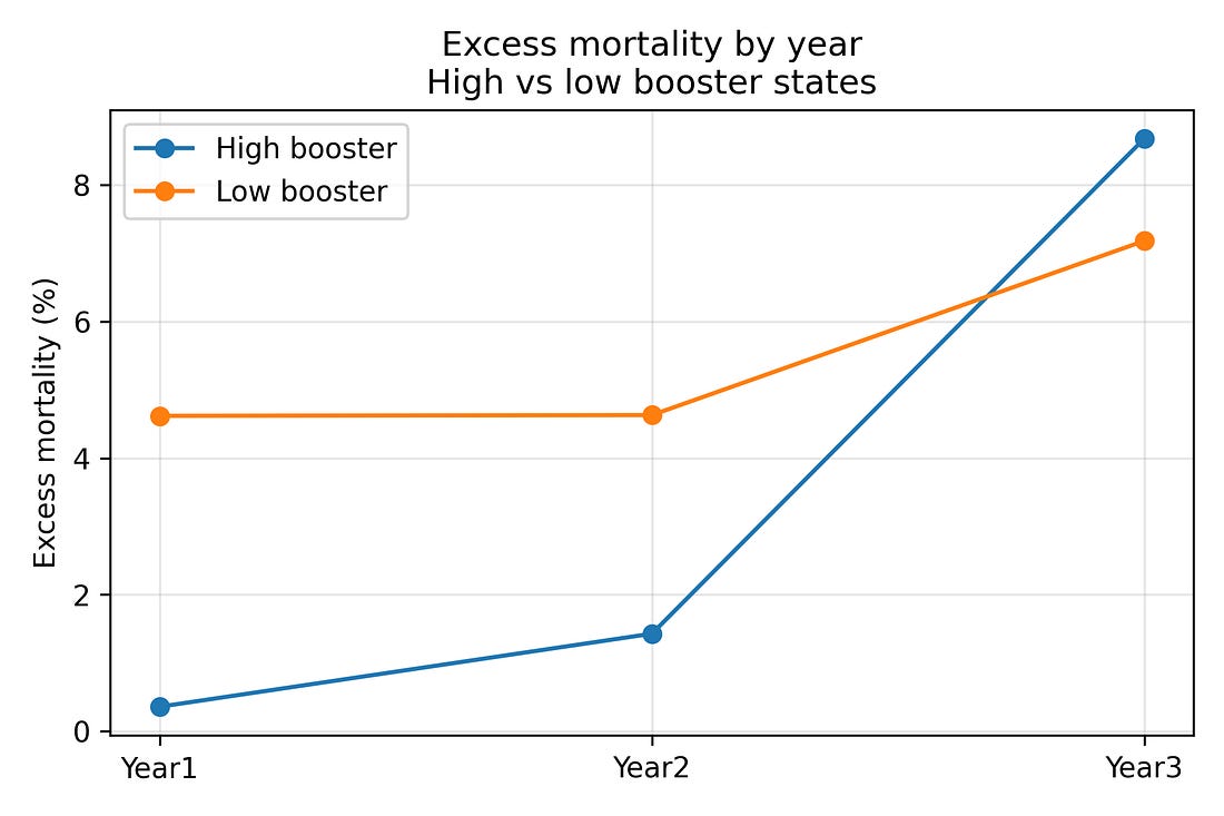
In Years 1–2, states that later became high‑booster tended to have lower excess mortality than low‑booster states.
By Year 3, that ranking reverses: high‑booster states now have higher excess mortality and larger increases relative to their own earlier years.
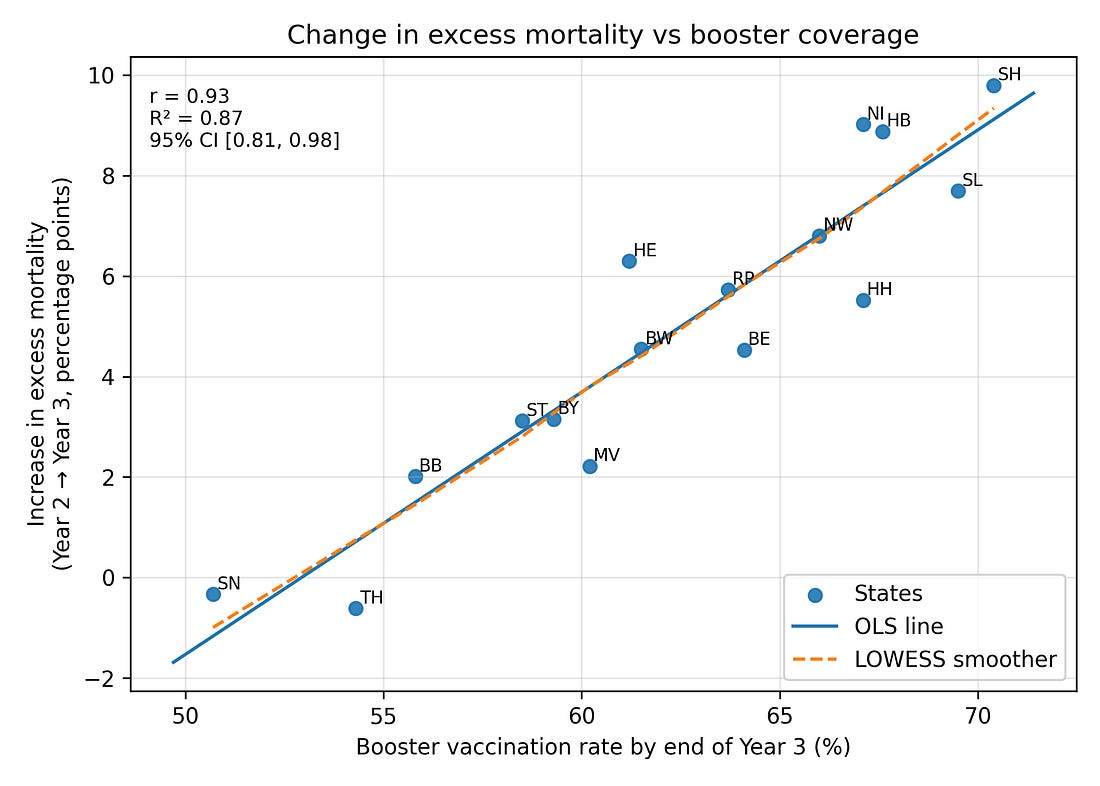
When you correlate booster coverage by the end of Year 3 with ΔEM (Year 2 → Year 3) across the 16 states, you get:
Pearson correlation r ≈ 0.93 (Very Strong / Extremely High)
Magnitude of the Linear Relationship
Any value over 0.90 is typically deemed extremely strong.
Coefficient of determination R² ≈ 0.87 (Strong Fit / Excellent Explanatory Power)
Proportion of Variance Explained
An R² of 0.87 means the predictor explains 87% of the outcome’s variation, indicating a strong fit.
95% confidence interval for r roughly [0.81, 0.98] (Robust / Statistically Stable)
Certainty of the Estimate
Since the entire interval is very close to 1.00, the true correlation can be considered robustly high.
Permutation p‑value (5,000 shuffles) around 0.0002 (Highly Significant)
Unlikelihood of Chance
This value is far below the α = 0.05 threshold, meaning the result is highly statistically significant.
In other words, about 87% of the variance in the Year‑3 mortality jump across states is aligned, in a simple linear way, with booster coverage. A Spearman (rank‑based) correlation gives a very similar story.
Figure 1. Booster uptake vs change in excess mortality (Year 2 → Year 3)
To see the reversal over time more directly, it is helpful to split states into two groups:
The eight states with the highest booster coverage by the end of Year 3
The eight states with the lowest booster coverage
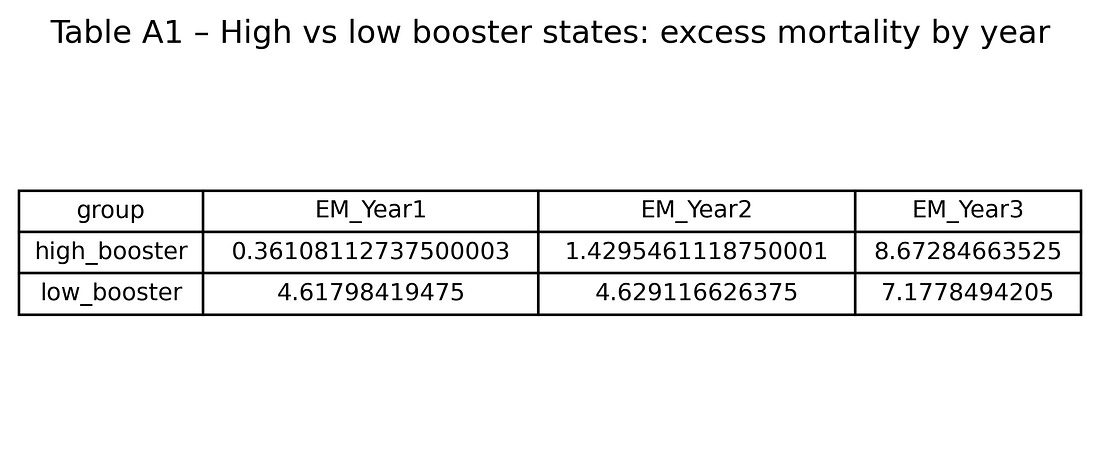
Averaging excess mortality within these two groups gives:
High‑booster states
Year 1: about 0.4% excess mortality
Year 2: about 1.4%
Year 3: about 8.7%
Low‑booster states
Year 1: about 4.6%
Year 2: about 4.6%
Year 3: about 7.2%
So high‑booster states start with lower excess mortality and end with higher excess mortality than low‑booster states. That three‑year flip is visible even before any modelling.
Figure 2. Excess‑mortality trends in high‑ vs low‑booster states (Years 1–3)
At this stage, this is merely a descriptive pattern. The rest of the analysis asks: is this a statistical fluke, a regional artifact (East vs West), a proxy for COVID burden or demographics – or something else?
4. What did not explain the Year‑3 jump?
The notebook systematically tests a range of alternative explanations:
COVID deaths and infections
Demographic structure (age, care‑needs share)
Socio‑economics (GDP per capita, poverty)
Policy stringency (“measures”)
Simple East vs West region effects
All correlations are computed for a grid of predictors vs outcomes (about 25 × 5 combinations), and then corrected for multiple testing using:
Benjamini–Hochberg and Benjamini–Yekutieli false‑discovery‑rate (FDR)
Bonferroni and Holm family‑wise error rate corrections
Only a small subset of associations survive these corrections.
4.1 COVID outcomes vs booster coverage
One natural hypothesis is that high‑booster states in Year 3 were simply those with worse COVID burden – more infections and more COVID‑labelled deaths – and that this, in turn, drove higher excess mortality.
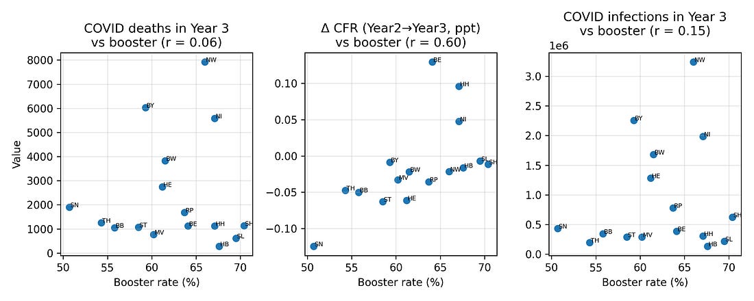
To test this, I looked at correlations between booster coverage and three Year‑3 COVID metrics:
COVID‑labelled deaths
Infections
Case fatality measures
Plotted against boosters, these metrics show at most modest relationships. In particular, COVID‑labelled deaths in Year 3 do not align strongly with booster coverage, nor with the Year‑3 excess‑mortality pattern.
Figure 3. COVID deaths, infections and case‑fatality change vs booster coverage (Year 3)
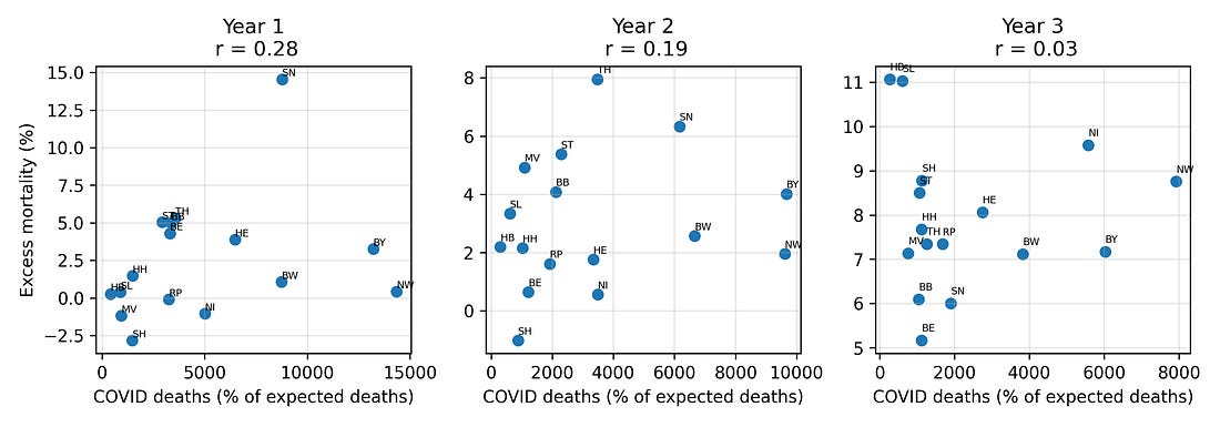
4.2 COVID deaths vs all‑cause excess mortality by year
If late‑pandemic excess mortality were primarily a story of COVID‑19 deaths, we would expect states with higher COVID‑labelled mortality to consistently show higher all‑cause excess mortality.
Instead, the relationship between COVID deaths and excess mortality shifts over time, and by Year 3 the two are largely decoupled: regions with more COVID‑labelled deaths are not necessarily the ones with the highest all‑cause excess mortality.
Figure 4. COVID‑19 deaths vs excess mortality, by pandemic year
This is one place where the “measurement” theme returns: once case definitions, testing strategies, and coding practices shift, the meaning of a “COVID death” label becomes unstable, even when all‑cause mortality remains hard.
4.3 Demography, socio‑economics and policy
The analysis also checks whether the Year‑3 mortality jump is better predicted by:
Mean age
Share of population in need of care
GDP per capita
Risk‑of‑poverty rate
Policy “measures” indices
Several of these variables correlate weakly with the Year‑3 mortality change in simple bivariate plots, but once multiple‑testing corrections are applied, those associations fail to reach standard significance thresholds.
4.4 East vs West
Another concern is that the pattern might simply reflect historical East/West differences: infrastructure, demography, pandemic timing, or attitudes to vaccination.
It is true that by Year 3, western states (which tended to vaccinate more) had higher excess mortality, while eastern states (which tended to vaccinate less) had lower excess mortality. A two‑sample t‑test confirms that the five eastern states had substantially lower mean ΔEM than the eleven western states.
However, when you put booster coverage and a simple East/West indicator into the same regression predicting ΔEM, the booster term remains strongly associated with the outcome, whereas the East/West dummy is not significant. Knowing whether a state is “East” or “West” adds little once you already know its booster coverage.
This suggests that the signal is not just a binary regional artifact; it runs along a gradient more closely aligned with vaccination rates.
5. How robust is the booster–ΔEM association?
With only 16 observations, any correlation – even 0.93 – must be treated with caution. To see how fragile or stable it is, the notebook applies several robustness checks.
5.1 Jackknife (leave‑one‑state‑out) analysis
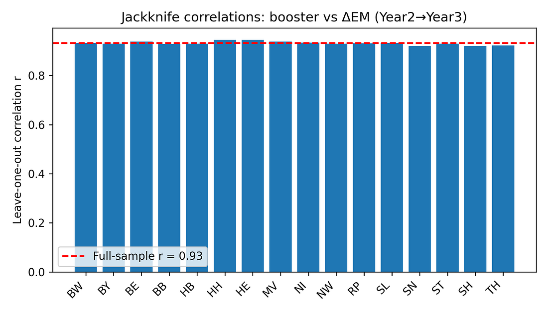
For each state, the correlation between booster coverage and ΔEM is recomputed after excluding that state. If the pattern were driven by a single outlier, one of these leave‑one‑out correlations would collapse.
Instead, all jackknife correlations stay in a tight range (roughly 0.92–0.95). No single state’s removal dramatically weakens the association.
Figure 5. Jackknife correlations: booster vs ΔEM (Year 2 → Year 3)
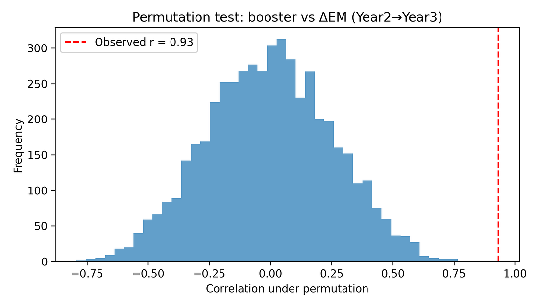
5.2 Permutation test (non‑parametric significance)
To avoid leaning on normality assumptions, a permutation test shuffles booster coverage across states 5,000 times, recomputing the correlation each time. This builds a null distribution of r values under the hypothesis of “no true association.”
The observed r ≈ 0.93 lies far in the tail of this distribution. None of the 5,000 random shuffles produced a correlation as extreme, giving a permutation p‑value around 0.0002.
Figure 6. Permutation test – null distribution of correlations
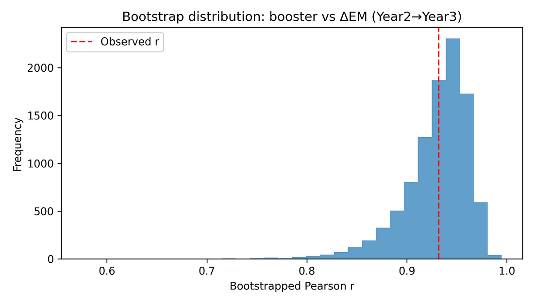
5.3 Non‑parametric and bootstrap checks
Additional checks include:
Spearman rank correlation between booster coverage and ΔEM, which remains very high (around 0.91) with a similarly small p‑value.
Bootstrap confidence interval for the Pearson correlation, using resampling with replacement. The resulting 95% interval for r is roughly [0.84, 0.97], consistent with the analytic CI.
These resampling‑based methods reinforce that the observed alignment is unlikely to be a fluke in a normally distributed world – it persists when we drop that assumption.
Figure 7. Bootstrap distribution of r (booster vs ΔEM)
5.4 Partial correlations: adjusting for earlier mortality
A key worry is regression to the mean (or mortality displacement). States hit hardest early may have fewer frail individuals left by Year 3, so their later increases in excess mortality might naturally be smaller.
Indeed, in the data, higher Year‑1 excess mortality is associated with lower increases thereafter. To probe this, the notebook computes:
Partial correlation between booster coverage and ΔEM, controlling for Year‑1 excess mortality.
This remains large (around 0.85) and statistically significant.
Partial correlation controlling for both Year‑1 and Year‑2 excess mortality.
The correlation is reduced but still clearly positive (around 0.7) and significant at conventional levels.
These checks show that while prior mortality dynamics matter, they do not eliminate the booster–ΔEM association.
5.5 Multivariate regression and diagnostics
As an exploratory step (bearing in mind N = 16), the notebook fits linear models of the form:
ΔEM (Year 2→3) ~ booster coverage + prior excess mortality + covariates
Example covariates include:
Year‑2 excess mortality
Mean age
GDP per capita
Risk‑of‑poverty rate
In these models:
Overall R² is high (around 0.9), reflecting that a small number of predictors can explain much of the variance in ΔEM across 16 states.
The booster term remains positive and significant even when adjusting for these covariates.
Variance‑inflation‑factor (VIF) diagnostics show moderate multicollinearity (as expected with overlapping socio‑economic indicators), but not pathologically high beyond the intercept.
Because
booster coverage is itself tightly correlated with some of the
covariates (especially prior excess mortality), the multivariate model
shows strong multicollinearity: the variance‑inflation factor for
booster is very large and the overall condition number is on the order
of 10⁶. This means the exact regression coefficients are unstable and
should be treated as descriptive, not as precise causal estimates.
In simple terms: the predictors overlap so much that the model can’t reliably tell ‘who gets credit’ for the explained variance.
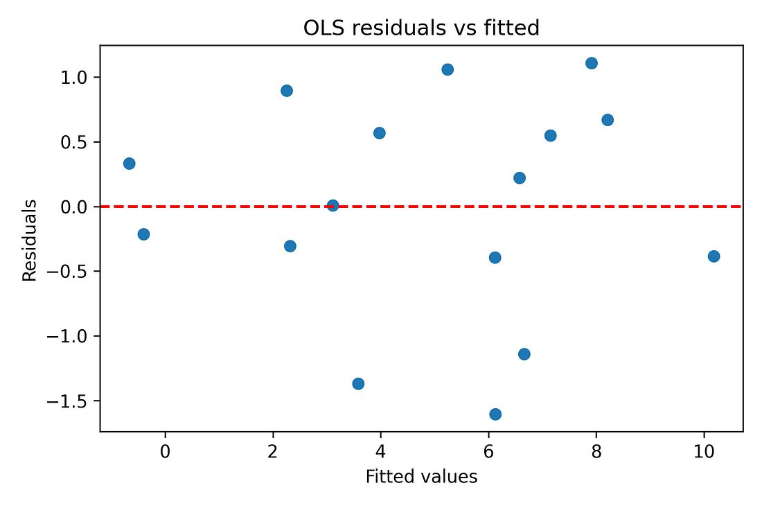
Regression diagnostics (residual‑vs‑fitted plots, QQ‑plots) are also produced in the notebook to make sure there are no glaring violations of linearity or normality. With N = 16, these are indicative rather than definitive, but nothing jumps out as catastrophically wrong.
Figure 8. OLS residuals vs fitted values (diagnostic)
Figure 9. Normal Q–Q plot of OLS residuals
Finally, to summarise all predictors at once, the notebook computes a correlation heatmap of the full predictor–outcome grid, applying FDR and Bonferroni corrections across tests. In that view, the Year‑3 vaccination metrics stand out as the only variables that remain strongly and consistently associated with the Year‑3 mortality change after controlling for multiple comparisons; other predictors show weaker, non‑robust alignment.
Figure 10. Predictor–outcome correlation heatmap (with FDR / Bonferroni)
6. Hard data vs soft data
At this point it is natural to ask: if the result is real, why doesn’t it show up more clearly in the official COVID statistics?
Here the distinction between hard and soft data matters.
Hard data: total numbers of people who died. In Germany, death registration is decentralised across thousands of local registry offices. To falsify the total count of deaths would require a very large, coordinated effort. When total all‑cause mortality moves, it almost certainly reflects real bodies.
Soft data: the labels attached to those deaths. Whether a given death is coded as “COVID” vs “heart disease” vs “cancer” depends on testing, coding rules, incentives, and human judgement. Those labels can and do shift over time, especially in a politicised environment.
The German dataset suggests that by Year 3, COVID‑labelled deaths had decoupled from all‑cause excess mortality. Whatever was driving the extra deaths in high‑excess states in 2022–23 did not map cleanly onto COVID labels.
This does not mean cause‑of‑death data are worthless. It means that if labels drift, statistics built on those labels (COVID deaths, COVID case‑fatality rates, etc.) become unstable. These issues did not suddenly appear in Year 3; test strategies and coding practices evolved throughout the pandemic, which is why labels alone are a shaky foundation for long‑term comparisons. In that situation, working with all‑cause excess mortality – while still imperfect, because it depends on a baseline model – is one of the more robust endpoints available.
The booster–ΔEM association emerges precisely when you focus on that hard endpoint, rather than on soft labels.
All of the results in this article are therefore conditional on the actuarial baseline used in the Kuhbandner & Reitzner paper; I do not recompute expected deaths, and different reasonable baseline choices could nudge the exact percentages while leaving the broad pattern intact.
In principle, a very different baseline could weaken or even remove the signal, but this would require a highly structured error: the expected‑deaths model would have to be mis‑specified in a way that varies by state and by year and just happens to be tightly aligned with booster coverage. I have seen no evidence for such a tailored error. For that reason I treat the Year‑3 change pattern as a real feature of this baseline rather than a pure artefact, while still acknowledging that a full baseline‑sensitivity study would be a valuable follow‑up.
7. What the results do not mean
Given the sensitivity of the topic, it is important to be explicit about what this analysis does not show.
No proof of causality.
This is an ecological study with 16 observational units (states). A strong correlation, even after robustness checks, does not establish that vaccines caused the observed excess mortality pattern. Many unmeasured factors could be driving both vaccination rates and mortality outcomes.No statements about individual risk–benefit.
The dataset contains no individual‑level vaccination or outcome data. It cannot tell you whether any particular person was helped or harmed by vaccination. It cannot quantify net benefit vs risk. Personal medical decisions require evidence of a completely different kind.Other factors are not excluded.
The analysis does not prove that COVID‑19 itself, delayed care, economic stress, ageing, influenza, heatwaves, or policy choices played no role. On the contrary, all of these likely contributed to the absolute level of excess mortality. What the analysis shows is about relative alignment: among the variables available in this dataset, the late‑pandemic mortality rise aligns most strongly with Year‑3 vaccination metrics and only weakly (if at all) with the usual alternatives.Baseline and model dependence.
Excess mortality is defined relative to an expected baseline, which itself is modelled. Different baseline methods can yield somewhat different percentage excess values. This analysis accepts the baseline used in the RSOS paper and asks what can be learned conditional on that choice. It does not explore alternative baseline methods.Fragile sample size.
With N = 16, any statistical inference is fragile. Parametric p‑values and normality tests are at best rough guides. This is why the notebook leans heavily on resampling methods (permutation, bootstrap, jackknife) and repeatedly frames the findings as hypothesis‑generating, not definitive.Risk of ecological fallacy.
Patterns observed at the group level do not necessarily hold at the individual level. If states with higher institutional trust both vaccinated more and adopted particular healthcare policies, then those policies (rather than vaccination) could be driving the mortality pattern, with vaccination acting as a correlated marker. Disentangling such possibilities requires more granular data.
8. Why the signal is still worth taking seriously
Despite these limitations, there are several reasons why the pattern should not simply be dismissed.
The association between booster coverage and the Year‑3 mortality jump is strong, monotonic, and robust to several stress tests (jackknife, permutation, bootstrap, partial correlations, multivariate adjustments).
Competing explanations within this dataset – COVID burden, age structure, care‑needs share, GDP, poverty, policy indices, East/West – do not match the strength or robustness of this association once multiple testing is controlled.
The full workflow is transparent and reproducible. Anyone can download the dataset, run the notebook, and see where they agree or disagree.
The responsible reading is not “vaccines definitely caused X,” but rather:
There is a statistically robust pattern in the German state‑level excess‑mortality data that standard explanations do not resolve. Its mechanism is unknown. Ignoring the pattern is not scientific; over‑interpreting it is also not scientific.
9. Where to go from here
If this is a genuine signal rather than a coincidence, it should show up in other datasets and at other levels of resolution. Some obvious next steps include:
Cause‑of‑death re‑analysis.
Compare detailed cause‑of‑death patterns between high‑excess and low‑excess states in 2022–23. Are particular categories elevated (cardiovascular, stroke, sudden death, accidents, suicide)? Do they track vaccination or other variables more closely?Individual‑level studies.
Link vaccination histories, prior health status, and subsequent outcomes at the person level, with appropriate adjustment for confounding and transparent reporting. Ecological patterns are useful for hypothesis generation; causal questions require individual‑level designs.Cross‑country comparisons.
Repeat the analysis with similar state‑ or region‑level data from other countries. If the same inversion (low‑excess early, high‑excess later, aligned with booster coverage) appears elsewhere, it strengthens the case for a genuine structural phenomenon. If it does not, that also tells us something important about Germany’s specific context.Sensitivity to baseline choices and model variants.
Explore how robust the signal is to different excess‑mortality baselines and to more complex models (panel regressions, non‑linear fits), always keeping in mind the tension between model complexity and sample size.
10. Conclusion: a signal, not a verdict
The German state‑level data from 2020–2023 contain a clear structural pattern: by the third pandemic year, higher‑vaccination states experienced larger increases in all‑cause excess mortality, and that pattern is not well accounted for by COVID‑labelled deaths, infections, age structure, economic indicators, or a simple East/West split.
Within the limits of this dataset and this design, that pattern is statistically robust. Its cause is unknown.
The appropriate response is neither denial nor premature certainty. It is to:
Treat the association as a hypothesis‑generating signal.
Be explicit about the limitations (small N, ecological design, measurement assumptions).
Encourage open, transparent follow‑up work with richer data.
Science cannot promise comforting answers, but it can insist on honesty about the structure of the evidence. Here, the evidence suggests that something in Germany’s late‑pandemic mortality landscape does not fit comfortably inside the official narratives.
The data and code are open. Anyone is free to re‑run the notebook, challenge the choices, and improve on the analysis. That, in the end, is the point.
Code: https://github.com/slashennui/german_signal/blob/main/notebooks/signal.ipynb
Repository: https://github.com/slashennui/german_signal
This repository contains the full Python workflow, dataset, and generated figures for an exploratory analysis of state-level excess mortality in Germany across the first three pandemic years.
Comprehensive Model Evaluation Metrics Dashboard: https://slashennui.github.io/tests_and_metrics/
Appendix: tables
Methods cheat‑sheet (for non‑technical readers)
This section is for readers who don’t live in statistics but want to understand what the main checks actually do.
Correlation (Pearson r)
What it is: A number between −1 and +1 that says how tightly two things move together in a straight‑line way.
+1 → perfect upward line
0 → no linear pattern
−1 → perfect downward line
Here: Pearson r ≈ 0.93 between booster coverage and the change in excess mortality from Year 2 to Year 3 means:
Across the 16 German states, those with higher booster levels also had larger increases in excess mortality, in a very consistent straight‑line pattern.
Important: Correlation describes how tightly two things go together; it does not tell you why they go together. It is not itself proof of causation.
Coefficient of determination (R²)
What it is: R² is simply the square of r in a simple straight‑line model. It tells you roughly what share of the differences in one variable can be lined up with differences in the other.
Here: R² ≈ 0.87 means about 87 % of the variation in the Year‑3 mortality jump across German states lines up with booster coverage in a one‑line picture.
Caveat: A high R² can still come from:
a confounder that affects both variables,
or model assumptions that don’t fully hold,
so R² should be read as “how strong is the alignment?” not “how much of the outcome has been explained?”
95 % confidence interval for r
What it is: A range of values we’d expect for the “true” correlation if we could repeat the data‑collecting process many times.
Here: The 95 % CI for r is roughly [0.81, 0.98]. That means:
Based on these 16 states, plausible values for the underlying correlation are all strong and positive, even in the most pessimistic end of the range (0.81).
Takeaway: This isn’t a borderline, flimsy effect hovering around zero; it stays strong across reasonable uncertainty.
Permutation test and p‑value
What it is: A shuffle test. We repeatedly mix up the pairing between states’ booster rates and mortality jumps (here: 5,000 times) and recompute the correlation for each random shuffle.
This gives us a picture of what correlations you’d see by pure chance if boosters and mortality were actually unrelated.
Here: None of the 5,000 shuffled datasets produced a correlation as large as the real one. The proportion of shuffles that did as well or better is about 0.0002 (0.02 %).
How to read 0.0002:
“If there were really no relationship at all, getting a correlation this strong just by accident would be extremely unlikely.”
Still not causality: It tells us the pattern is unlikely to be pure noise; it doesn’t tell us why the pattern exists.
Jackknife (leave‑one‑state‑out analysis)
What it is: A robustness check: we drop one state at a time, recompute the correlation 16 times, and see if the result collapses when any particular state is missing.
Here: All leave‑one‑out correlations stay very high (roughly 0.92–0.95).
What that means:
The pattern is not driven by a single “weird” state; it’s a consistent pattern across the map.
Bootstrap
What it is: Another resampling method. We create many “fake” datasets by re‑sampling the 16 states with replacement, and recompute the correlation for each resample. This shows how much the correlation would bounce around if we had repeated samples of similar size.
Here: The bootstrap histogram is a tight hump far above zero; most values are between about 0.84 and 0.97.
Interpretation: The booster–mortality alignment is strong and stable even after we account for sampling uncertainty.
Spearman correlation (rank‑based)
What it is: A correlation based on rank order instead of raw values. It checks whether “higher booster state → higher mortality jump” holds monotonically, even if the relationship is not perfectly straight.
Here: Spearman ρ is also around 0.9, with very small p‑value.
Use: Confirms that the signal is not just an artefact of one extreme point pulling a straight‑line fit; it also shows up in the ranking of states.
Partial correlation
What it is: Correlation between X and Y after removing the effect of a third variable Z from both.
Think of it as: “What is the relationship between boosters and the Year‑3 mortality jump among states that had similar prior mortality?”
Here: When we control for earlier excess mortality (Year 1, and Years 1 & 2 together), the booster–ΔEM correlation is reduced but remains clearly positive and statistically strong (~0.85 down to ~0.7).
Interpretation:
Earlier mortality dynamics matter (regression‑to‑the‑mean is real), but they do not fully explain the alignment with boosters.
Multiple‑testing correction (FDR / Bonferroni)
Problem: When you test many predictors against many outcomes, some will look “significant” just by luck (even if nothing is going on).
What we did: Apply methods such as:
Bonferroni
Benjamini–Hochberg false‑discovery‑rate (FDR)
to raise the bar for significance when lots of tests are being run.
Here: After corrections:
Booster and 2‑dose coverage still stand out as significant for the Year‑3 mortality jump.
Other variables (age, poverty, GDP, COVID deaths/infections, policy stringency) do not.
Interpretation: The booster signal is not just one lucky hit in a sea of noise; it remains when we properly control for multiple comparisons.
Regression (OLS) and diagnostics
OLS model: A straight‑line model that predicts the Year‑3 mortality jump using booster coverage plus some other covariates (prior mortality, age, GDP, poverty).
Why only exploratory: With only 16 states, a model with several predictors can overfit. That’s why the regression is treated as a sensitivity check, not the centrepiece of the argument.
Diagnostics used:
Residuals vs fitted plot: Checks if the line is a reasonable summary or if there’s a strong curve/funnel left in the residuals.
Normal Q–Q plot: Checks whether residuals look roughly like “random noise” rather than some highly skewed pattern.
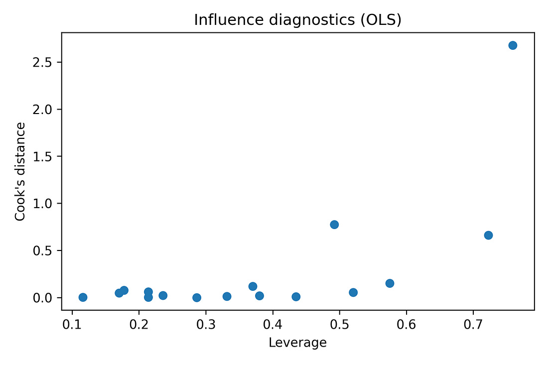
Leverage vs Cook’s distance: Checks whether any one state has huge influence on the fitted line.
Takeaway: The diagnostics do not show any state completely dominating the fit, and they do not scream “hopeless model,” but given N = 16, the regression results are still treated with caution.
How to interpret the figures, tables and key numbers (for non‑technical readers)
This section is meant as a “picture tour.” You can skim it alongside the figures and tables in the article.
Key numbers you’ll see repeatedly
Before we go figure‑by‑figure, here is how to read the core numbers:
Pearson correlation r ≈ 0.93
Very strong positive alignment between:
X‑axis: booster coverage
Y‑axis: change in excess mortality from Year 2 to Year 3
In plain English: “States that boosted more tended to have bigger late‑pandemic increases in excess deaths, in a very consistent way.”
Coefficient of determination R² ≈ 0.87
Roughly: about 87 % of the differences in the Year‑3 mortality jump between states sit along this one booster axis in a straight‑line picture.
It does not mean 87 % of deaths were “caused by” boosters; it only describes how much of the pattern can be lined up with boosters in this simple model.
95 % CI for r ≈ [0.81, 0.98]
Even at the low end (0.81), the correlation would still be strong.
This says: “Within reasonable uncertainty, the alignment is always strong and positive.”
Permutation p‑value ≈ 0.0002 (5,000 shuffles)
Imagine randomly re‑assigning booster rates to states 5,000 times and checking the correlation each time. Only about 0.02 % of those random worlds produced a correlation as strong as the one we actually observed.
In everyday terms: “If there were no real relationship, seeing a pattern this strong just by luck would be extremely rare.”
Figure‑by‑figure guide
Figure 1 – Change in excess mortality vs booster coverage
core_corr_booster_delta23.png
What it shows
Each dot = one German federal state.
Left–right = how many people got a booster (third dose) in that state.
Bottom–top = how much excess mortality changed from Year 2 to Year 3.
How to read it
The dots form a tight upward band: states with higher booster uptake also had bigger increases in excess mortality in Year 3.
The straight red line and the r/R² numbers summarise that pattern numerically.
Important
This is a very strong association, but not proof of causation. It tells us “these two things moved together across states,” not “one definitely caused the other.”
Figure 2 – High‑booster vs low‑booster states over three years
trend_reversal_high_low.png
What it shows
The 16 states are split into:
8 with higher booster uptake
8 with lower booster uptake
Lines show average excess mortality for each group in Years 1, 2 and 3.
How to read it
Year 1: high‑booster group starts with lower excess mortality than the low‑booster group.
By Year 3: the high‑booster group ends with higher excess mortality.
The lines literally cross over.
Why it matters
This figure visually captures the “reversal” that the numbers describe: a late‑pandemic flip in which states that were initially doing better end up doing worse.
Figure 3 – COVID‑labelled deaths vs all‑cause excess mortality
covid_deaths_vs_em_by_year.png
What it shows
Three small plots, one for each pandemic year.
Each dot = one state.
X‑axis: COVID‑labelled deaths.
Y‑axis: all‑cause excess mortality.
How to read it
If dots sit near an upward diagonal line → COVID labels track total excess deaths reasonably well.
If dots are scattered all over → COVID labels are not explaining total excess deaths.
Takeaway
By Year 3, the dots are much more scattered. COVID‑labelled deaths no longer line up neatly with all‑cause excess mortality.
This is why the analysis focuses on all‑cause mortality rather than on labels alone.
Figure 4 – Booster vs COVID outcomes (Year 3)
booster_vs_covid_metrics.png
What it shows
Three side‑by‑side plots, all with boosters on the X‑axis:
Boosters vs COVID‑labelled deaths (Year 3)
Boosters vs change in crude fatality rate (Year 2 → Year 3)
Boosters vs infections (Year 3)
How to read it
Look at how tight or loose the cloud of points is:
Tight, clear slope → strong relationship
Loose scatter → weak relationship
Why it matters
This lets you visually compare:
Do boosters line up more with recorded COVID outcomes, or with changes in all‑cause mortality?
In this dataset, the link to the mortality jump is stronger than the link to the COVID labels.
Figure 5 – Predictor vs outcome correlation heatmap
predictor_outcome_heatmap.png
What it shows
A coloured grid.
Each row = a predictor (booster rate, 2‑dose rate, age, GDP, etc.).
Each column = a mortality outcome (Year‑1 EM, Year‑2 EM, Year‑3 EM, ΔEM Year 2→3).
Colours:
Red = strong positive link
Blue = strong negative link
Pale = little or no link
How to read it
Focus on the column “ΔEM Year2→Y3” (the Year‑3 jump).
Strong red cells in that column are predictors that line up with the late‑pandemic mortality increase.
Takeaway
The booster‑related rows stand out as deep red, while most other predictors are pale.
That is the visual summary of “among everything we measured, the standout alignment with the Year‑3 jump is in the vaccination metrics.”
Figure 6 – Jackknife correlations: is one weird state driving the result?
jackknife_correlations.png
What it shows
Each bar = correlation after dropping one state and recomputing the booster–mortality relationship.
How to read it
Bars all similar and high → no single state is responsible.
One bar much lower → one state is disproportionately influential.
Takeaway
The bars are nearly identical.
The signal is not being driven by Bremen, Saxony, or any other single outlier; it’s a pattern across the map.
Figure 7 – Permutation test: could this be pure chance?
permutation_histogram.png
What it shows
A histogram of correlations created by randomly shuffling booster rates between states thousands of times.
Grey bars = correlations you’d get if boosters and deaths were unrelated.
Red dashed line = the real correlation (~0.93).
How to read it
If the red line sits far out where the grey bars are tiny or absent, the observed correlation is very unusual under “no relationship.”
Takeaway
The red line is out in the tail: if there were no real link, seeing a correlation this large by accident would be very unlikely (p ≈ 0.0002).
Figure 8 – Bootstrap distribution: how uncertain is r itself?
bootstrap_r_booster_delta23.png
What it shows
A histogram of correlations generated by bootstrap resampling the 16 states.
How to read it
Wide, flat histogram → big uncertainty.
Tight hump far from zero → strong, stable association.
Takeaway
Most of the mass is well above 0.
The booster–mortality alignment remains strong and positive even when we account for sampling uncertainty.
Figure 9 – OLS residuals vs fitted values (diagnostic)
ols_resid_vs_fitted.png
What it shows
Each point = one state.
X‑axis: model’s predicted value for ΔEM.
Y‑axis: residual (predicted minus actual).
How to read it
We want an even cloud around zero, not a strong curve or funnel.
Big patterns would suggest the straight‑line model is missing something obvious.
Takeaway
With only 16 states the picture is coarse, but there is no dramatic curve or funnel.
A simple linear model is a reasonable summary, used here only as a secondary, exploratory check.
Figure 10 – Normal Q–Q plot of OLS residuals
ols_qq.png
What it shows
Compares the residuals from the regression to what we’d expect from a perfect bell‑curve (“normal”) distribution.
How to read it
Points near the diagonal → residuals behave roughly like “normal noise.”
Strong bends away from the line → the model is missing structure or the errors are very skewed.
Takeaway
The points are reasonably close to the line.
This suggests the basic regression assumptions are not badly violated, given the small sample.
Supplementary figure – Influence diagnostics (leverage vs Cook’s distance)
ols_leverage_vs_cooks.png
What it shows
Each point = one state.
X‑axis: leverage (how unusual its predictor values are).
Y‑axis: Cook’s distance (how much it can pull the regression line).
How to read it
Points far to the right and high up would be very influential.
A cluster near the lower‑left means no state dominates.
Takeaway
There is no single state that completely controls the multivariate fit.
This supports the jackknife result: the signal is not just one extreme state.
Tables A1–A3 – numeric summaries
You may also see three tables embedded or shown as images:
Table A1 – High vs low booster states: excess mortality by year
table_A1_high_vs_low_booster.png
This table puts Figure 2 into numbers: average excess mortality for the high‑ and low‑booster groups in Years 1, 2 and 3.
It shows precisely how big the crossover is.
Table A2 – Core correlation: booster vs ΔEM (Year 2→Year 3)
table_A2_core_corr_booster_deltaEM.png
This table collects the headline numbers:
r, R², 95 % CI, N states, permutation p‑value.
It is the quick reference for “how strong is the booster–ΔEM association, and how unlikely is it to be pure chance?”
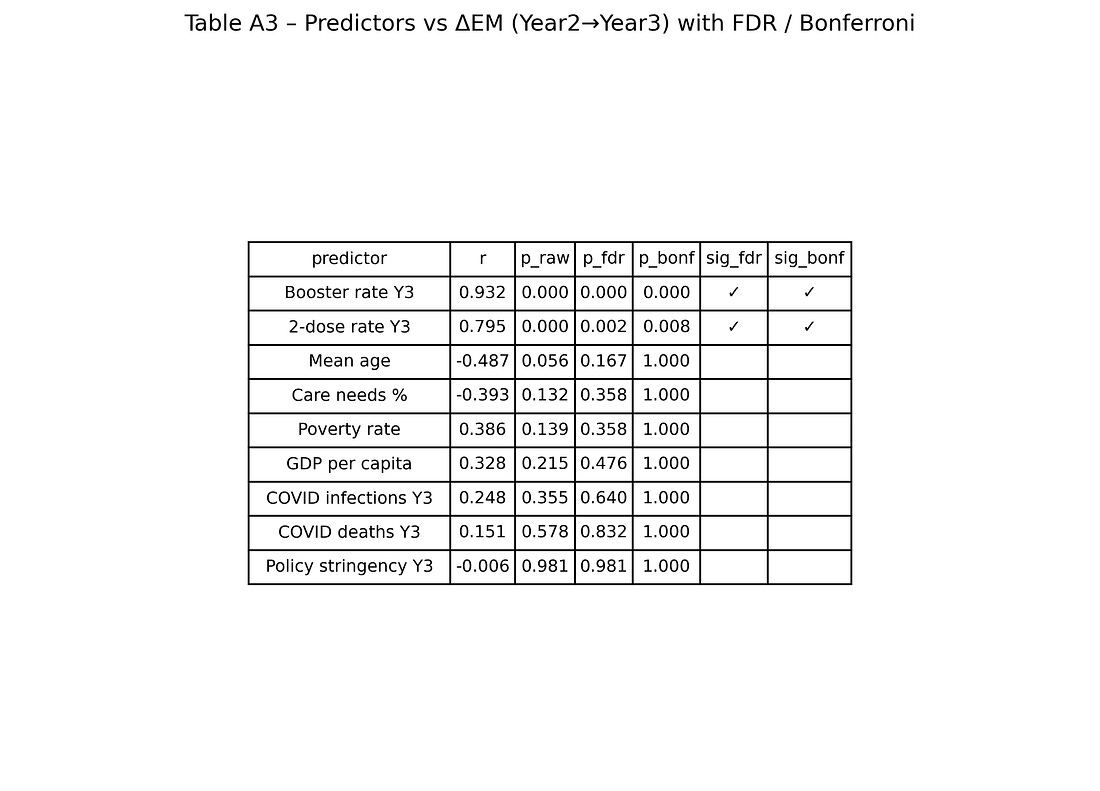
Table A3 – Predictors vs ΔEM with FDR / Bonferroni
table_A3_predictors_vs_deltaEM.png
Each row = one predictor (booster, 2‑dose rate, age, GDP, poverty, COVID deaths, etc.).
Columns = raw p‑values and adjusted p‑values after multiple‑testing corrections, plus flags for which remain significant.
The visual story:
Booster and 2‑dose coverage stay significant after corrections.
Other predictors do not.
This is the numeric backbone of the claim that “among the variables available, vaccination metrics are the ones most tightly aligned with the Year‑3 mortality jump.”
Glossary (for non‑technical readers)
Excess mortality (EM)
The
percentage difference between how many people actually died in a period
and how many would have been expected to die based on previous years.
Positive EM means “more deaths than expected”; negative EM means “fewer
deaths than expected.”
ΔEM (change in excess mortality)
The Greek letter Δ (delta) just means “change.”
In this article, ΔEM (Year 2→Year 3) means:
(Excess mortality in Year 3) − (Excess mortality in Year 2)
So a ΔEM of +5 means excess mortality went up by 5 percentage points from Year 2 to Year 3.
Pandemic Year 1 / 2 / 3
Three 12‑month periods defined in the original paper:
Year 1: April 2020 – March 2021
Year 2: April 2021 – March 2022
Year 3: April 2022 – March 2023
Federal state
One of the 16 regions of Germany (Bundesländer), such as Bavaria, Saxony, Berlin etc. Each dot in most charts is one state.
Booster rate / booster coverage / third‑dose rate
The percentage of people in a state who had received a third dose (booster) of a COVID vaccine by the end of Year 3.
2‑dose rate / “fully vaccinated”
The percentage of people in a state who had received at least two doses of a COVID vaccine.
COVID‑labelled deaths
Deaths that were coded as COVID‑19 in the official statistics. These depend on testing, diagnostic rules, and coding practices, not only on biology.
All‑cause mortality
The total number of people who died, regardless of cause. This does not depend on how deaths are labelled.
Baseline mortality
The
expected number of deaths if the pandemic had not happened, estimated
from previous years. Excess mortality is measured relative to this
baseline.
Statistical terms
Correlation (Pearson r)
A number between −1 and +1 that describes how strongly two things move together in a straight‑line way.
r near +1 → when one goes up, the other almost always goes up too.
r near 0 → no clear linear relationship.
r near −1 → when one goes up, the other tends to go down.
In this article, r ≈ 0.93 between booster rates and ΔEM means a very strong upward alignment across states. Correlation describes pattern, not cause.
Spearman correlation (ρ)
A version of correlation that uses the rank order
of values (who is 1st, 2nd, 3rd…) instead of their exact numbers. It
checks whether “higher booster state → higher mortality jump” holds in
terms of ordering, even if the relationship is not perfectly straight.
Coefficient of determination (R²)
Essentially r²
in a simple straight‑line setting. It is the fraction (between 0 and 1)
of how much of the differences in one variable can be lined up with
differences in the other in a linear model.
Here R² ≈ 0.87 means about 87% of the variation in ΔEM between states lies along the booster axis in a simple line‑fit picture.
Confidence interval (CI)
A range of values that expresses uncertainty around an estimate. A 95% confidence interval for r is a range of correlations that are reasonably compatible with the observed data.
Here, a CI of [0.81, 0.98] means the underlying correlation is very likely somewhere between 0.81 and 0.98 – always strong and positive.
p‑value
Roughly: “If there were really no relationship, how likely would it be to see a pattern at least this strong just by accident?”
A small p‑value (like 0.0002) means “this would be very rare if nothing was really going on.” It does not tell you the probability that the hypothesis is true or false.
Permutation test
A “shuffle test” for p‑values. We repeatedly randomly re‑assign
booster levels to states (breaking any real link) and recompute the
correlation thousands of times. This shows what correlations we would
see by chance alone.
The permutation p‑value is the fraction of shuffles that produce a correlation as strong as the actual one.
Bootstrap
A way to measure uncertainty by resampling the data. We create many “fake” datasets by sampling the 16 states with replacement,
recompute the correlation each time, and see how those values spread.
This gives a data‑driven confidence interval without heavy assumptions.
Jackknife / leave‑one‑out analysis
A robustness check where we drop one state at a time and recompute the key result. If the outcome hardly changes, the result is not driven by any single “weird” state.
Partial correlation
Correlation between two variables after removing the effect of a third variable from both. It answers:
“If states had similar prior excess mortality, how much do boosters and the Year‑3 mortality jump still move together?”
This helps check whether a third factor (like earlier mortality) could be explaining the pattern.
Multiple‑testing correction (Bonferroni, FDR)
When you test many predictor–outcome pairs, some will look “significant” just by luck. Multiple‑testing corrections raise the bar
so that the overall false‑alarm rate stays under control. If a
relationship remains significant after these corrections, it is less
likely to be a random fluke.
Modelling terms
Predictor (independent variable)
A
variable used to help explain or predict another variable. Examples
here: booster rate, mean age, GDP per capita, COVID cases, etc.
Outcome (dependent variable)
The variable we’re trying to understand or predict. In this article, the main outcome is ΔEM (Year 2→Year 3).
Covariate / control variable
A
variable added to a model alongside the main predictor to adjust for
other influences (for example, prior excess mortality, age, or GDP).
OLS regression (ordinary least squares)
A
straight‑line model that predicts an outcome from one or more
predictors (for example, ΔEM from boosters + prior mortality + age).
“OLS” is just the standard way of fitting that line by minimising
squared errors.
Residual
For each state, the difference
between the model’s prediction and what actually happened. Residuals
are used in diagnostic plots to check whether the model is missing
obvious patterns.
Diagnostic plots
Graphs
(like residuals vs fitted, Q–Q plots, leverage vs Cook’s distance) used
to check whether the regression assumptions are badly broken, or
whether a single data point has huge influence.
Study‑design terms
Ecological analysis / ecological study
A study that uses group‑level data (here: states) rather than individual people. It can detect patterns at the group level but cannot directly tell you what happens for individual people. Inferring individual risk from group data is called the ecological fallacy.
Hard data vs soft data
Hard data: numbers that are difficult to manipulate or redefine, such as total deaths recorded by registry offices.
Soft data: numbers that depend heavily on definitions and labels, such as “COVID death,” “hospitalised with COVID,” or cause‑of‑death categories. These can change when definitions or coding practices change.
Confounder
A
third factor that affects both the predictor and the outcome and may
create or hide a relationship between them. For example, if wealthier
states both vaccinate more and have different healthcare patterns, wealth could confound the relationship between vaccination and mortality.
| |||||
| |||||
To summarise, humanity is full of nonsense and thus mostly meaningless. |











No comments:
Post a Comment