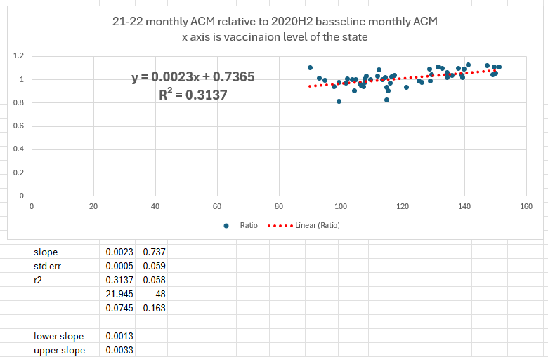
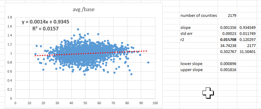
Simple linear regression of official CDC data shows COVID vaccination is associated with increased mortalityIf you wanted to prove the vaccine worked, this is the data and approach you'd use. It shows the COVID vaccine was a failure. If you followed their advice, it increased your risk of dying.Executive summaryIf you wanted to show the American public that the COVID vaccines saved lives, the easiest proof is to plot each state (or county) based on its vaccination rate (x axis) and its change in mortality from pre-vaccination baseline on the y-axis. I did this. The slope is positive. This means that more vaccinations are associated with higher mortality. Can this be challenged? I don’t think so. The data is the data. They can’t change it. And there is only one way to draw a line through the data. This is likely why not a single paper attempts to do the most obvious analysis. They probably did it, saw that it was not supporting the narrative, and then decided not to publish. Results for state regression and county regressionThe slope was positive and statistically significant for both the state and county analysis. This means that the COVID vaccines did the opposite of what they promised: it increased your risk of death. The R2 value of .31 is quite spectacular and it means this isn’t an accident.
Data sourcesThe detailsx-axis: doses/100p (as of Nov 2021) for state; % of fully vaccinated (as of Jan 4, 2022) for county y-axis: average(2021,2022) mortality divided by the baseline mortality. The baseline mortality is calculated in the same state/county in the second half of 2020 (excluding December since December was half vaxxed vs. pre-vax) In short, I took the closest baseline for each state/county and compared it with the total 2021/2022 mortality. The method and choice of baseline were validated by ChatGPT as being the most appropriate and accurate. It was indeed since the 2021/2022 mortality vs. baseline was nearly exactly 1.0 suggesting a very accurate baseline pick. For the counties, the average y value was 1.0021 which is damn close to 1. So it was an excellent baseline! You always want your baseline to be RIGHT BEFORE the intervention and it should be very close to the numbers right after the intervention. Did I make a mistake?If you think I made a mistake, let me know in the comments. The analysis is as straightforward as it gets. Download the CDC data, create a pivot table, create the x and y values, and plot it. Or start with the spreadsheets in the Data section above. No sleight of hand involved. SummaryThere is simply no way to spin this as the vaccine provided a benefit. All the data is from the CDC and there is only one way to draw a line through it. If the vaccine worked, they’d be promoting these graphs to prove to you it worked. But the graphs show that the CDC recommendations were more likely to kill you than to save you, so that may be why they aren’t promoting this data. I asked ChatGPT for a comparable analysis of the CDC data showing the opposite slope for the change in ACM vs. vaccination rate and it couldn’t find a single paper. So now you know. Do you enjoy my posts?If you appreciate the work I am doing and want to see me continue to provide these types of insights, please consider becoming a paying subscriber for just $5/mo. Thanks! Invite your friends and earn rewardsIf you enjoy Steve Kirsch's newsletter, share it with your friends and earn rewards when they subscribe.
|
No comments:
Post a Comment