|
US and UK all-cause cumulative excess mortality graphs clearly show that our interventions were counterproductive
Four graphs. Do you think the COVID interventions saved lives? No chance. These charts are monotonically increasing which means everything we did was useless or made things worse!
Executive summary
Three graphs, pulled from Mortality Watch, paints a clear picture of a bungled COVID response that cost lives.
US cumulative excess mortality (ages 10-19)
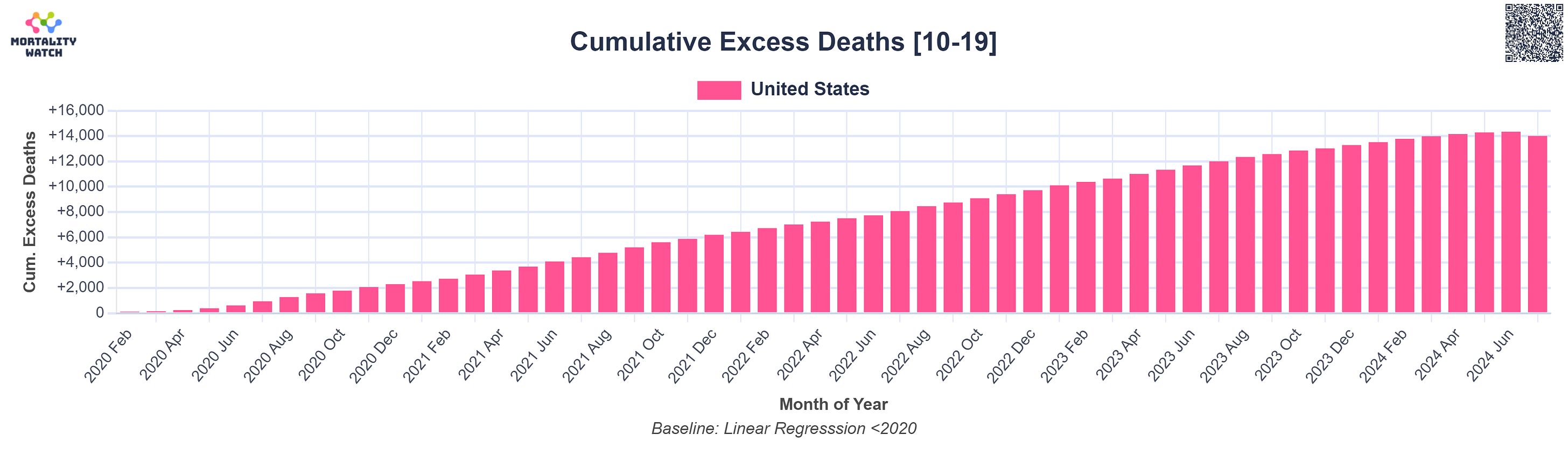 |
This is very disturbing. This smacks of pure human intervention because the cumulative mortality rises by nearly the same amount every month. That kind of effect rarely, if ever, happens in nature.
We didn’t save any kids! We KILLED 14,000 kids.
Very few of these were COVID deaths. How do I know? Because COVID deaths come in waves. No waves here.
US cumulative excess mortality (all ages)
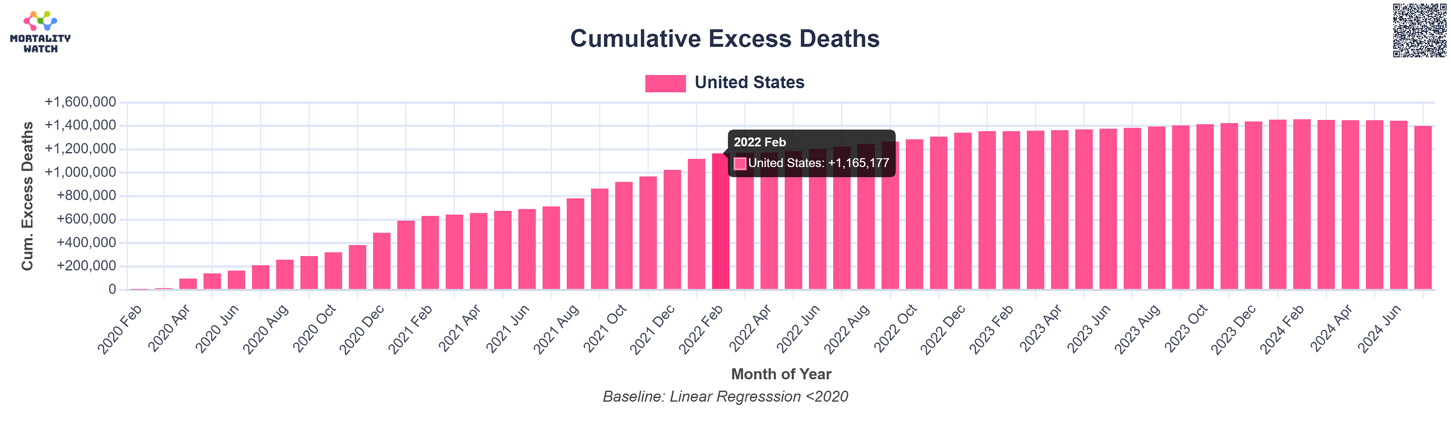 |
You can clearly see that 1.4M lives were lost since the start of the pandemic.
What you can’t tell from this is what caused these deaths.
But what you can tell is that it got monotonically worse over time, not better.
The CDC mortality report says there were 415,399 deaths caused by COVID in 2021 and an estimated 346,082 in 2020 (from 90% of the value listed in the Table). So a total of 761K deaths from 2020 to 2021. There were 1,024K excess deaths available during this period, so their estimates are within reason. In 2022 there were 246K and in 2023 there were 49K. This totals 1.056M deaths through the end of 2023. It leaves 400K excess deaths unaccounted for.
Based on surveys I’ve done, the total number of deaths from COVID were comparable to the number of people killed by the COVID shots.
This suggests that the CDC miscategorized deaths and there were probably somewhere around 600K COVID deaths and about 600K vaccine deaths.
Since there were 676M shots given, that’s an estimated 1 death per 1,000 COVID shots, a number consistent with the estimates done by others that I’ve written about in previous articles (Rancourt, Crawford, Skidmore).
The cure was actually more deadly than the disease.
There’s a cool paper coming out about this soon. Watch for it. It’s conclusion is exactly that.
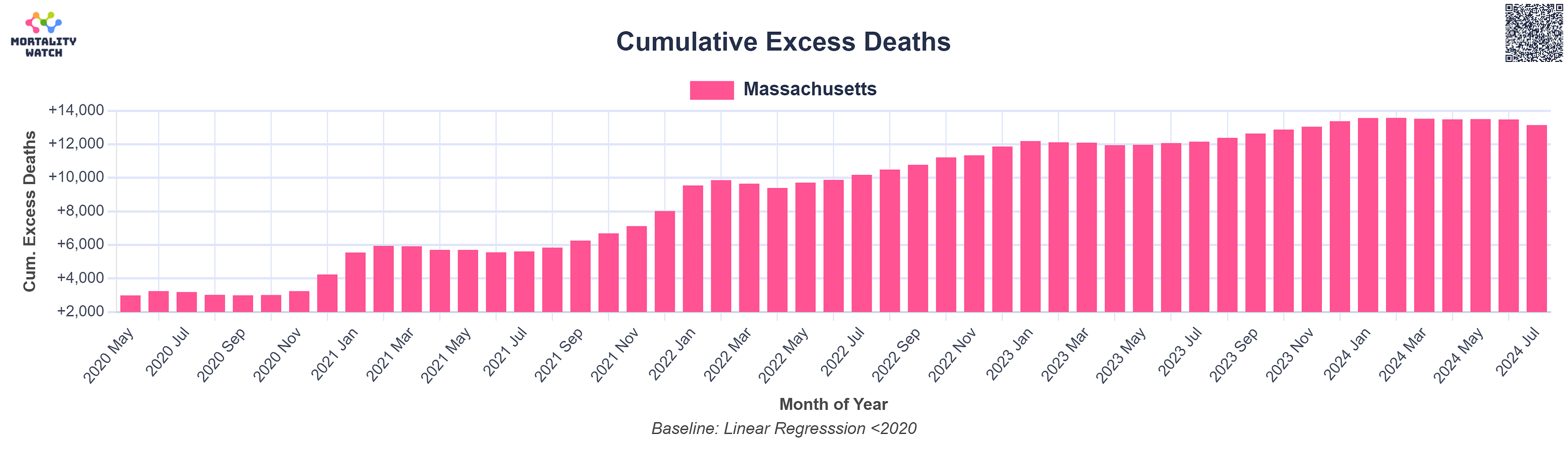
UK and Massachusetts cumulative excess mortality
Look at these two charts. They look really similar, don’t they? But one is from Massachusetts and the other from the UK.
 |
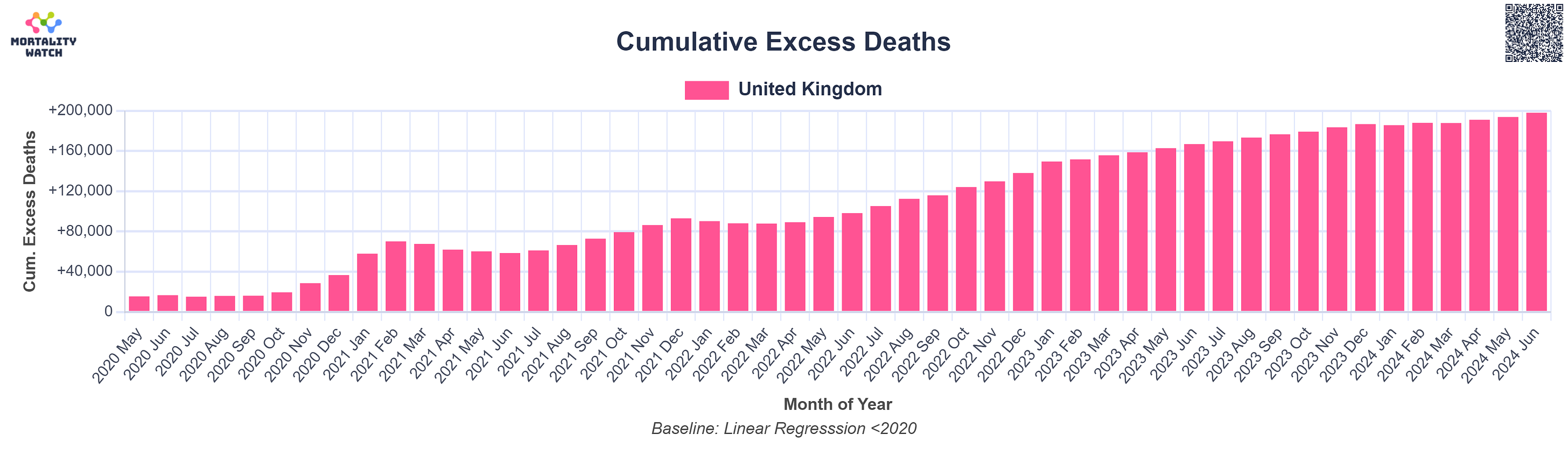 |
The question you have to ask yourself is how can these graphs look so similar?
Answer: The pandemic responses were very similar and they had similar outcomes, with huge numbers of excess deaths that have gone unexplained. Deaths started to take off after the COVID shots rolled out.
The UK has never explained their excess deaths and I’ve written how their hypotheses are all flawed because they don’t correlate. They won’t consider the possibility that the COVID shots might have played a role even though that is the most obvious explanation.
Summary
This article shows you graphs which are monotonically increasing; this means all our interventions either were useless or made things worse.
My estimate is that the COVID shots killed around 1 person per 1,000 doses. So around 650,000 Americans lost their lives to the shots.
The cure was worse than the disease.
You're currently a free subscriber to Steve Kirsch's newsletter. For the full experience, upgrade your subscription.
![]()
![]()
No comments:
Post a Comment