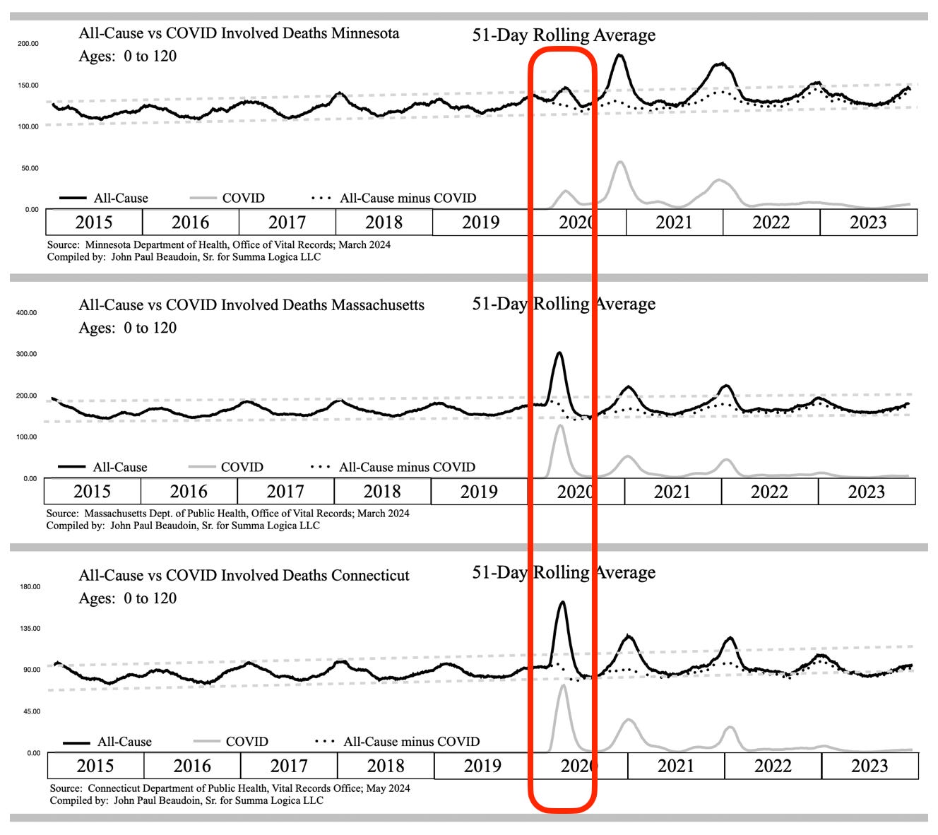
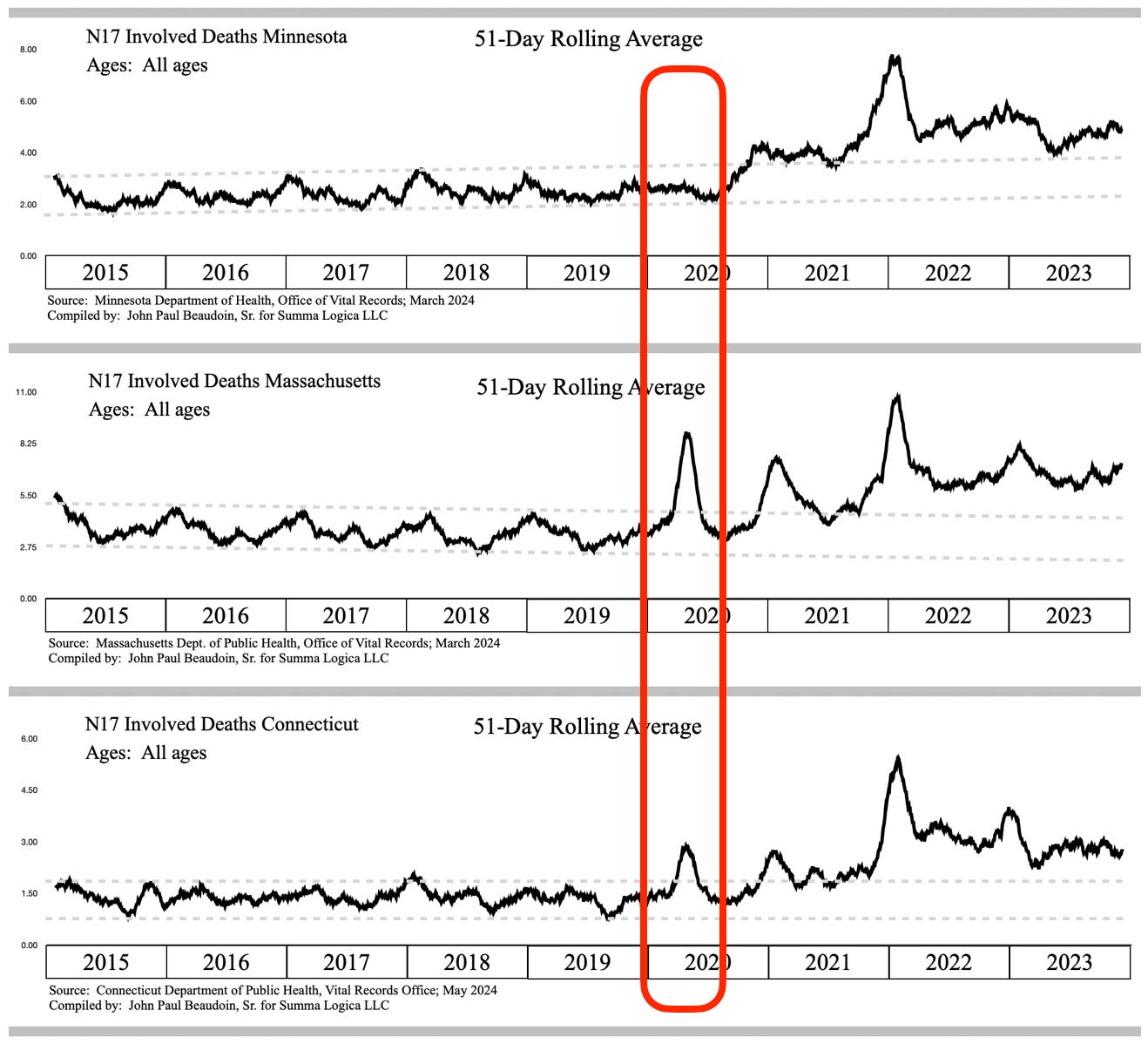
Prevalence-of-Cause (PoC)New Variable Explained - Percent of All-Cause Adjusts for Spikes in Causes that Get Swept up in Spikes of All-Cause Death CountFigure 1 - Taken from EXHIBIT F associated with THE CONNECTICUT MEMORANDA SERIES - Volume IThe gray lines in Figure 1 represent purported covid deaths in Minnesota (MN), Massachusetts (MA), and Connecticut (CT) from top waveform to bottom waveform, respectively. These gray lines are deaths involving covid on death records. The dotted lines represent the subtraction of covid deaths from All-Cause deaths, which are the black lines in the waveforms. The dotted lines show massive covid over-counting (fraud) during the winters of 2020/2021 and 2021/2022, but that’s not the thesis of this article. Clearly, the covid deaths match perfectly to the All-Cause excess deaths, especially in the red outlined area first wave in each of the three (3) states. Now let’s look at sudden kidney failure, aka acute renal failure (ARF), aka acute kidney injury (AKI). Figure 2 - Taken from EXHIBIT F associated with THE CONNECTICUT MEMORANDA SERIES - Volume IFirst, note in Figure 2, in the red outlined area, that MN has zero indication of an association between covid and AKI. Next, note that MA and CT AKI involved deaths absolutely have an association with covid in the first covid wave in the red outlined area. However, note that the ratio is very different between them. Both MA and CT are in AKI excess during the time All-Cause is in excess and the time covid is prevalent. How can that be? How can a disease cause an increase in one area, but not the other area 1,300 miles away? It sure does not seem like the disease caused this. The contrast is stark. WHAT DID MASSACHUSETTS HOSPITALS DO DIFFERENTLY THAN MINNESOTA FROM MARCH THROUGH JUNE 2020? Massachusetts claimed to be the leader in covid treatment planning. I remember Governor Baker telling us that. Perhaps the reason for Massachusetts having a correlation between covid and AKI in the first wave is because Massachusetts was ahead of other states in the use of dangerous treatment protocols put out by the National Institutes of Health (NIH), one institute of which is the National Institute of Allergies and Infectious Disease (NIAID), headed at that time by Dr. Anthony Fauci. Here is a paper citation. Note the date, authors, title, journal name, and publisher. Dolin, R., Hirsch, M. (May 27, 2020). Remdesivir — An Important First Step. The New England Journal of Medicine. Massachusetts Medical Society. Found at https://www.nejm.org/doi/full/10.1056/NEJMe2018715 on July 18, 2024.Let’s look at where the authors are from —
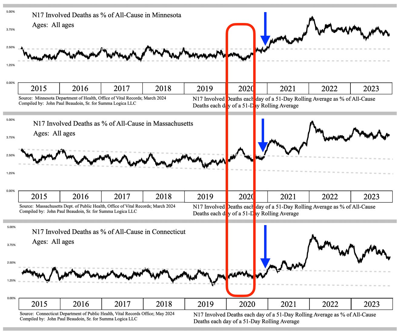
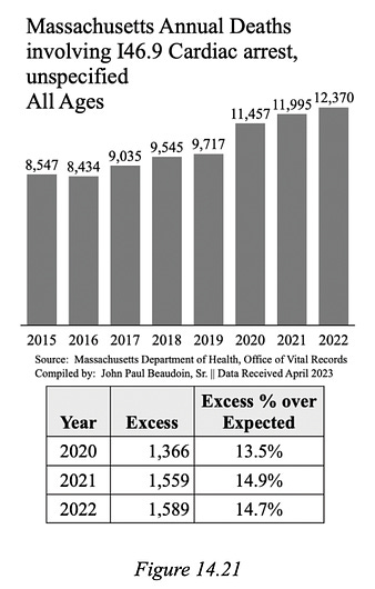
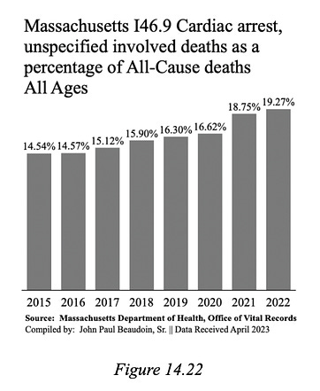
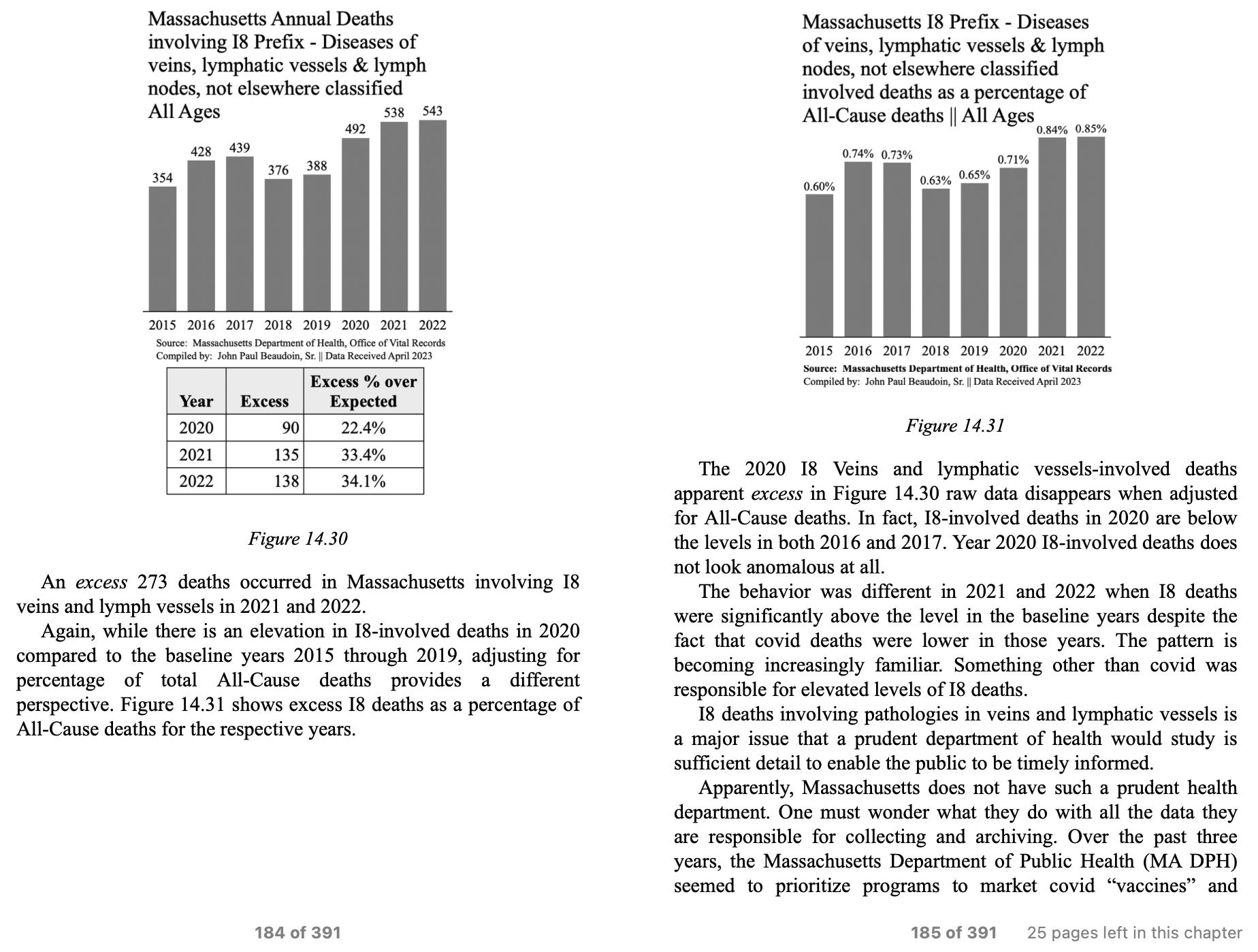
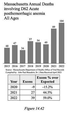
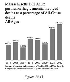
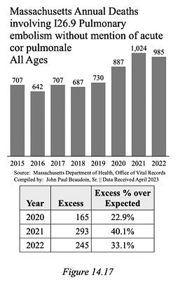
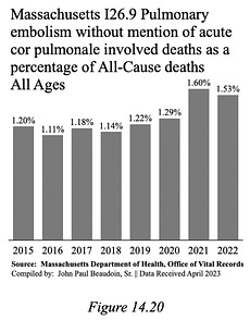
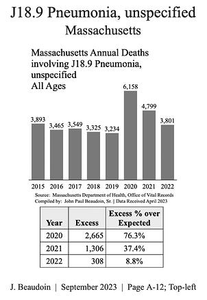
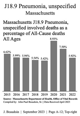
It sure looks like MA was first to use remdesivir widely across two large hospitals in the state capitol city. If the paper was published late May, then they must have collected the data for the paper from the preceding months, which are that first covid wave in Figures 1 and 2. CT abuts MA and may have been influenced to used the early protocols clearly used in MA. MN probably did not get the message to use the NIH protocols yet, thus zero correlation to AKI in that first wave. I am not saying that I know remdesivir causes AKI. AKI may be caused by any one or a combination of drug treatments. The main point I wish to convey is that the government is not studying this mass-casualty event in the United States that varies by state and time based on what was used to treat COVID-19. For someone to argue that different variants hit different location at different times and manifested in different causes of death is a ludicrous balderdashical whimsy of science™. Before further opining and hyperbole, let’s get to the point of this article. What is the prevalence of a cause of death among all deaths? For each day, after 51-day curve smoothing, divide the number of AKI deaths by the number of All-Cause deaths, then graph along the same nine-year (9yr) period. Let’s call this the prevalence of the cause under study (AKI, in this case) among all deaths. PoC = Prevalence of Cause Figure 3 - Taken from EXHIBIT F associated with THE CONNECTICUT MEMORANDA SERIES - Volume IFigure 3 shows that The PoC of the MA first wave is nearly normal with a slight blip increase. The PoC of the CT first wave is completely gone. The PoC of the MN first wave is still gone. Now look at when N17 ARF/AKI departs normal as defined by the gray dashed line guard rails established from 2015 through 2019. In December 2020, the signal departs the upper bound guard rail never to return for all three states. In fact, N17 is a massive increase of deaths documented in THE CONNECTICUT MEMORANDA SERIES - NOTICE OF HOSPITAL HOMICIDE & ACUTE RENAL FAILURE DEATHS - Vol. I. The blue arrows in Figure 3 show where AKI departs normal and starts killing 100% more than normal over a few years. The NIH treatment protocols were adopted by all states in the late autumn of 2020 because of how “successful” they were in MA and CT. Apparently, “success” means something different for the government than it means for you and me. When the 20% add-on payment began on November 2, 2020, only a few short weeks or days later, AKI began to take the lives of an excess 155,000 people through 2023. Just imagine such a mass-casualty event greater than smallpox, polio, H1N1, Hong Kong flu, and even greater than covid in life-years-lost, going unnoticed by 250,000 public health employees in federal and state governments. All the doctors, biologists, and researchers in the field are not immune to the blindness. Read my book, The Real CdC, to determine why EBM is a stain on the medical profession. Sheep don’t just live on one side of the fence between two sheep farms. How do you like the PoC variable?Let’s look at more examples and use PoC on bar graphs to see if there is a noticeable difference. I46.9 Cardiac arrest, unspecified raw data is in Figure 14.21 from The Real CdC. Pay close attention to Year 2020 as it relates to its neighbors 2019 and 2021. In this first graph of raw data, the 2015 through 2019 trend jumps up in 2020 and then continue at an elevated level through 2021 and 2022. Now let’s look at the PoC version of this I46.9 Cardiac arrest, unspecified. See Figure 14.22 taken from The Real CdC. The increase did not happen in 2020, the year of the massive covid wave in MA. The increase is now shown to have happened in 2021, the year of the COVID-19 “vaccine.” Clear as day you can see that the PoC of I46.9 Cardiac arrest demonstrates 2020 prevalence in line with normal (2015-2019). 2021 is when the excess as a PoC of Cardiac arrest began. The only reason 2020 is in excess is because so many excess people died in 2020, which carried nearly all causes of death in excess in a big wave of deaths. Below is another excerpt from The Real CdC showing PoC as a valuable visualization tool yet again. Here’s another set from the book. Sudden blood loss anemia doubled and they were non-traumatic. All of a sudden you die from bleeding out: aortic dissection, GI hemorrhage, hemorrhagic stroke et al. 2020 was not involved regardless of PoC. Let’s look at one more before closing. Question — Did pulmonary embolism excess occur in 2020 before the “vaccine” and during the huge covid wave in Massachusetts?Here are the two graphs. You decide what really happened from 2019 to 2020 to 2021. Well, what do you think? Did covid cause the PEs? Or did the year of vax cause PEs? Now I feel like I have to provide one more to show you something that did correlate with covid in 2020 even after taking the PoC of it. What would you most associate with covid? Pneumonia is now viewed under the lens of PoC. The following two (2) graphs are taken from THE CDC MEMORANDUM (2024) found at TheRealCdC.com. There appears to be no difference in the transitions from 2019 to 2020 to 2021 on either graph. This is good confirmation that AKI, PE, and Cardiac arrest rose not with covid, but rather with covid “vaccination.” SummaryI really hope people understand all the data tricks and manipulation that can be performed and they understand the importance of true visualizations such as the Prevalence-of-Cause (PoC) variable. Untangling signals is a process that requires an open mind and ingenuity to try different views to determine where an inflection point or anomaly occurs. ARF/AKI is mass casualty event that needs to be studied immediately. I maintain that it would take only one man-week of work with official state data files to determine the cause of renal failure. 155,000 excess ARF/AKI deaths across USA demand that an earnest investigation be done immediately. States have access to medical files of decedents. The vital signs, blood lab reports, imaging reports, administrations of medicaments and procedures are all in the records. What did a patient receive and when did they receive it measured against the time series of vitals and diagnostics will likely be able to ascertain causality. This is a serious issue. The governments declared war on The People and they mean to reduce the population and create misery for all who do not reach their inner oligarchy. God bless us all Isaiah 5:20Woe to those who call evil good and good evil, who put darkness for light and light for darkness, who put bitter for sweet and sweet for bitter.Safe and effective they are not. COVID-19 Treatment recommendations are meant to kill people to drive up covid death totals. And this plan worked as intended. Coquin de Chien’s Newsletter is free today. But if you enjoyed this post, you can tell Coquin de Chien’s Newsletter that their writing is valuable by pledging a future subscription. You won't be charged unless they enable payments. |
No comments:
Post a Comment