Now everyone can easily prove the vax should be stopped
I'll describe how you can ask just FOUR questions about people who died since 2020 and you will see for yourself why the vaccines should be stopped.
Executive summary
Now, with a simple four question survey, anyone can prove for themselves the vaccines should be stopped. So if you don’t believe me, or if you are confused by conflicting studies and data, collect your own data. It will then be crystal clear who is telling the truth.
My data showed that, among other things, “died suddenly” wasn’t an issue at all for those <65 who were unvaccinated in 2021 and 2022. But it was the #1 cause of death for those in that age group who were vaccinated in the same 2021-2022 timeframe. How will they explain that? Why is it just the vaccinated who are dying suddenly in large numbers?
Have you ever wondered why isn’t anyone in the mainstream media or any public health authority doing this simple survey? It’s simple: it would reveal that the vaccines killed more people than COVID did. That would destroy trust in the medical community, members of Congress, the mainstream media, state and local legislators and public health officials, government health organizations (CDC, FDA, NIH, …). That’s why they will not do this survey. They will never do this survey.
Note that my physician office survey is the most telling because of the professional judgments as to the cause of deaths. The advantage to this method is that people can run their own surveys and see the anomalies for themselves.
Introduction
My latest survey shows you don’t need to be a math genius to figure out whether the COVID vaccines are safe or not. You just survey people and ask four questions about anyone who died in 2020 and beyond:
Age
Whether they were vaccinated with the COVID vaccine
Year of death
Causes of death
That subset of my survey is all you need.
About the graphs
I used a filter condition of RecordID <= 1260 AND country = USA and Integrity=1 (it passed various sanity checks). This way, my charts are repeatable if records are added to the database.
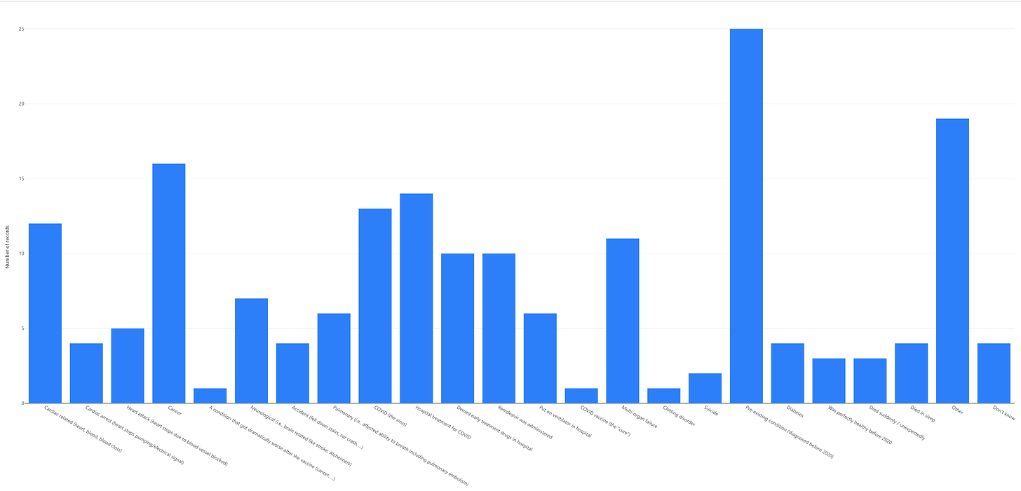
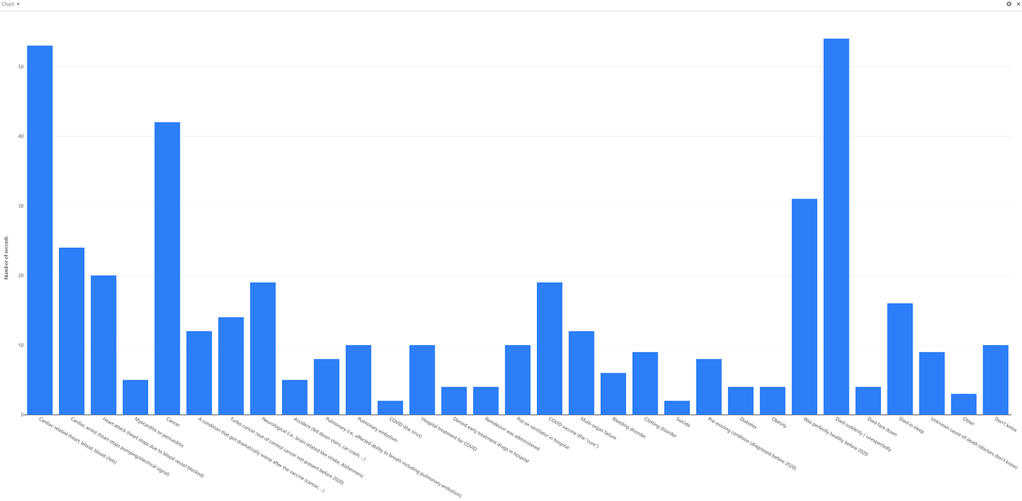
For age ranges: <65 and 65 and older, I show three charts: 2020 causes of death, 2021/2 unvaxxed causes of death, and 2021/2 vaxxed causes of death. If the vaccine is perfectly “safe and effective” like they say, the vaxxed will have a shape that only differs from the others with a lower COVID death rate. Ignore the scale on the graphs… it’s the overall “shape” of the various death causes that matters, not the absolute number of reports. For example, here’s the first chart.
And here is the final chart filter condition:
Causes of death: baseline data (2020)
Note that the columns don’t line up because Airtable omits them if they are zero.
Note: Click each chart below to see it full size.
Age <=65, Died in 2020
Note:
Cancer is the #1 killer (nearly double the next leading cause of
death), Hospital treatments for COVID is next, Cardiac related and
sudden death are around equal. The COVID virus is next. Turbo cancers,
pulmonary embolism, heart attack, unknown cause of death are all low and
comparable to each other. Turbo cancer is 1/9 of cancer reports. No myocarditis deaths.
Age >65, Died in 2020
Note: Pre-existing conditions are the top cause of death. Cancer is next. COVID is next. Cardiac issues are the next. Cardiac related and sudden death are around equal. The COVID the virus is next. pulmonary embolism, heart attack, unknown cause of death are all low and comparable to each other. There are NO turbo cancer deaths!! No myocarditis deaths.
Causes of death: unvaccinated people (2021 - 2022)
Age <=65, Died > 2020
Hospital
treatments for COVID are the #1 killer. People who died suddenly,
pulmonary embolism, and turbo cancers are all very low. There are no unknown causes of death. No myocarditis deaths.
Age >65, Died > 2020
Hospital treatment for COVID is the #1 killer. Heart attack, turbo cancer, and died suddenly are all low. There are no myocarditis deaths.
Causes of death: vaccinated people (2021 - 2022)
Age <=65, Died > 2020
Died suddenly is now the #1 cause of death, followed closely by cardiac-related death. Stop right there. This should be a showstopper.
Cancer is next. Turbo cancer is now significant compared to what it was before. Myocarditis is now a player and is killing more than COVID.
Age >65, Died > 2020
Cancer is the #1 cause of death. Turbo cancers are huge compared to those without the vaccine. Died suddenly is significantly elevated.
Do you see the difference?
If these charts look the same to you, you should immediately apply for a job at the CDC in the vaccine safety monitoring program.
If you are a “misinformation spreader” like me, you’ll see some huge differences for the vaccinated including:
Sudden death rates are off the charts for the vaccinated cf. unvaccinated for those <65. This is stunning. It’s the #1 cause of death for this age group. This is not surprising as we are seeing this every day.
Myocarditis as a cause of death is registering now for both age ranges but only for the vaccinated. The doctors assure us it is lower in the vaccinated, but that’s not what the data says, and I can’t find a single cardiologist whose number of myocarditis cases went down after the vaccines rolled out.
Cardiac issues as a cause of death in vaccinated young people (<65) are significantly elevated vs. their unvaxxed peers.
It’s no wonder that nearly all the cardiologists in the UK aren’t getting any more boosters.
Doing more complex analysis
I’m sure Joel Smalley and others will be able to do more sophisticated analysis (and do so on more than just the causes of death), but the graphs above show the vaccines aren’t “safe and effective,” not even close.
Other analyses (using other methods) should consider:
You need to compare vaxxed v. unvaxxed by age group since higher portions of the elderly are vaxxed
In 2020, everyone is unvaxxed so there will be NO vaccinated deaths in 2020.
Comparing vaxxed deaths in 2021 + 2022 to all deaths in 2020 would be fair if we look at the relative death causes. If we are looking at absolute numbers, there will be some recall bias so need to account for that.
The population of the vaxxed vs. unvaxxed changes over 2021. So when comparing the absolute number of deaths, we need to account for that.
Vaccines in other countries may not be as dangerous so keep in mind the region. If the analysis is repeatable by region, that’s telling.
There are a lot of things you can look at including the bias of the reporter, e.g., will triple vaccinated reporters find fewer attributes for death causes.
This is not a complete list. The point is if you want to go beyond this analysis, you should know what you are doing so you don’t spread misinformation.
Other recent news: the COVID vaccine makes you more susceptible to infections in general
Loads of data now appearing on how the vaccines damage your immune response:
This is a short piece by Karl Denninger -
Original more technical post by Rintrah - The trainwreck of all trainwrecks: Billions of people stuck with a broken immune response
Here is an easy to read write up by Igor Chudov: Booster-Caused IgG4 Immune Tolerance Explains Excess Mortality and "Chronic Covid" In the Covid-Boosted
As Igor would say, “Perhaps giving unproven vaccines to billions was a bad idea, after all.” And now a top Israeli scientist (vaccinated 3 times) speaks out
Next steps
Gather more data
Complete more analyses
Present the data into a form where you can see the differences more clearly, e.g., looking at each cause of death and comparing the normalized numbers for the three cases (2020, unvaxxed, vaxxed). So we’d show 3 bars for each cause of death normalized to some factor that is not closely related to the vaccine, such as people dying from obesity or accidents.
I wanted to put this out now so others know what signals to look for (and because I have a Twitter debate coming up on Wednesday).
Summary
More analyzes forthcoming, but just in looking at the “cause of death” profile, we can clearly see very large safety signals in the vaccinated that are consistent with what we’ve been saying since early 2021: the vaccines are unsafe and should be halted. None of the elevations in rates for causes come as any surprise at all; they confirm our previous results.
We also see that hospital treatments for COVID are killing massive numbers of people as well.
In short, our interventions (vaccines, standardized hospital COVID treatments) made things worse, not better.
If we had promoted early treatment protocols, we’d have been much better off. But that would mean the vaccine wouldn’t be approved, so nobody was interested in verifying the patient records of those treated with these protocols.
Will anyone replicate this survey? No. There is nothing for them to gain by doing so and everything to lose.
Will any state release the cause of death and vax status for everyone who died in their state? Of course not! John Beaudoin offered to do the correlation for free for any state that would give him access to the records, but no state was interested because they don’t want to know.
So you’ll only find this data here for now.
Please encourage your friends to fill out the survey so we can collect even more data and make the results even more compelling. This survey collects a lot of data so it can be analyzed in many different ways. We definitely will need more people to fill this out to get compelling results.


No comments:
Post a Comment