Official Figures: COVID-19 Yet to Impact Europe’s Overall Mortality
Year-to-date statistics show excess mortality lower than previous years
The official figures for 24 countries across Europe show, not
only that overall mortality is not increasing, but – so far – it is
actually well below recent averages.
The statistics were gathered by the European Monitoring of Excess Mortality for Public Health Action (EuroMOMO), an international partnership of agencies from 24 European nations aiming to promote preparedness for public health emergencies.
They track “excess mortality”, meaning the number of officially recorded deaths vs the average death
rate.
We recommend you check their website, where each country is broken down by age demographics. Today, we’re focusing on their maps.
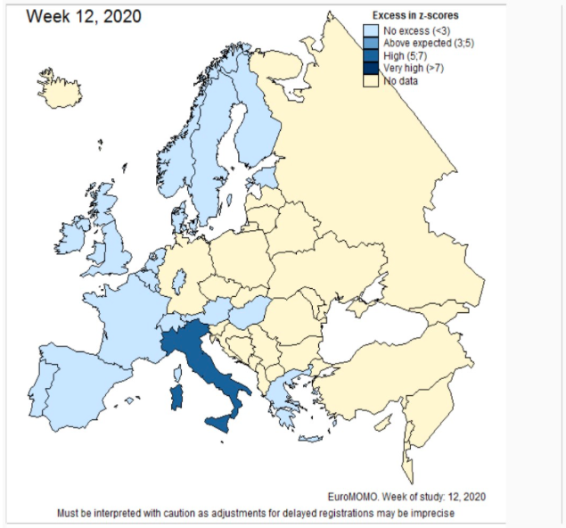
Here is the map showing Europe’s excess mortality for Week 12 of 2020 (19th-25th March):
For some context, maybe we should compare it to previous years.
Here is week 6 of 2019:

We didn’t have a global lockdown in 2019.
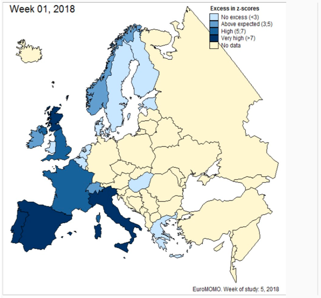
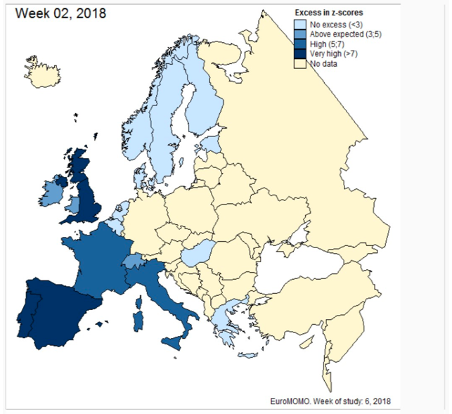
Here are weeks 1 & 2 of 2018:
We didn’t have a global lockdown in 2018.
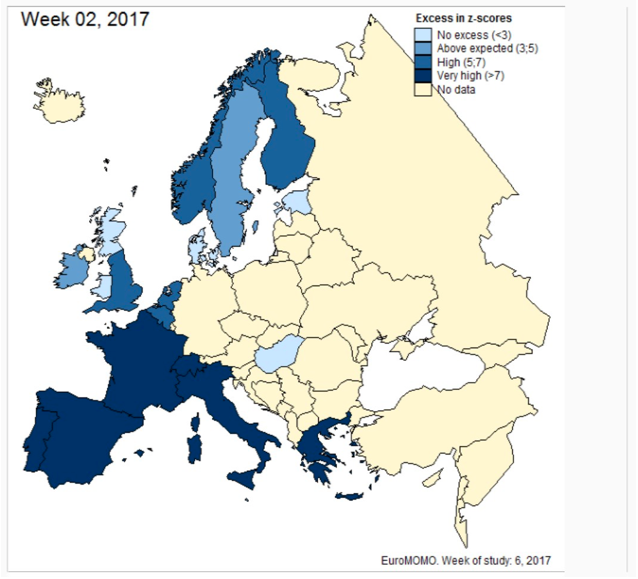
Week 2 of 2017 was even worse:
We didn’t have a global lockdown in 2017.
Obviously, things may change (week 13’s results are due tomorrow), but – as it stands – the 2020 figures are substantially lower than the previous three years.
So, the question is, if we didn’t have a lockdown in 2017, and we didn’t have a lockdown in 2018, and we didn’t have a lockdown in 2019….why do we have a lockdown now?
*
Comment on Global Research Articles on our Facebook page
Become a Member of Global Research
The statistics were gathered by the European Monitoring of Excess Mortality for Public Health Action (EuroMOMO), an international partnership of agencies from 24 European nations aiming to promote preparedness for public health emergencies.
They track “excess mortality”, meaning the number of officially recorded deaths vs the average death
rate.
We recommend you check their website, where each country is broken down by age demographics. Today, we’re focusing on their maps.
Here is the map showing Europe’s excess mortality for Week 12 of 2020 (19th-25th March):

MOMO Europe mortality, week 12 2020
As you can see, currently, the vast majority of Europe shows “no excess”. That means deaths are either at or below expected levels. Italy is the one obvious exception. But note it is only on “high”, not “very high”.For some context, maybe we should compare it to previous years.
Here is week 6 of 2019:

MOMO Europe mortality, week 6 2019
As you can see, it’s generally much worse. Several countries in
“above average”, Spain and Portugal on “high”, and France is even “very
high”.We didn’t have a global lockdown in 2019.
Here are weeks 1 & 2 of 2018:

MOMO Europe mortality, week 1 2018

MOMO Europe mortality, week 2 2018
This was the height of the huge 2017/18 flu season. As you can see, Europe was greatly affected.We didn’t have a global lockdown in 2018.
Week 2 of 2017 was even worse:

MOMO Europe mortality, week 2 2017
The whole of Western Europe experienced a huge spike in excess mortality, especially bad in all the Mediterranean countries.We didn’t have a global lockdown in 2017.
Obviously, things may change (week 13’s results are due tomorrow), but – as it stands – the 2020 figures are substantially lower than the previous three years.
So, the question is, if we didn’t have a lockdown in 2017, and we didn’t have a lockdown in 2018, and we didn’t have a lockdown in 2019….why do we have a lockdown now?
*
Note to readers: please click the share
buttons above or below. Forward this article to your email lists.
Crosspost on your blog site, internet forums. etc.
Featured image is from CODEPINK
The original source of this article is OffGuardian
Copyright © OffGuardian, OffGuardian, 2020
Comment on Global Research Articles on our Facebook page
Become a Member of Global Research

No comments:
Post a Comment